


Trash Panda
Areas of Focus
- Using research to guide & focus the team
- Collaborating with different functions to create cohesive product
- Creating an executable design that the team can quickly iterate on
Important Details
- 8 weeks to deliver fully functional product
- Provided with a Product Vision to expand
- Team included 2 designers, 4 data science partners, and 4 web devs
Humans need to rethink how we are interacting with our environment. Creating better recycling habits will directly affect the world and how the future lives in it.
Focus on reaching as large an audience as possible and help them to create better recycling habits.
Using research to refine how we can help
Initially, we knew we wanted to work with Earth911. Their API would give us the data we needed to create some kind of informational base to build from.
Data we could expect from Earth911:
- Specific item descriptions. Items included plastic bottles, engine parts, household cleaners, etc.
- Location-based information on how each item is disposed of or recycled in that area.
- Location-based information on specific disposal facilities that accept the item in question.
My partner and I decided to start with analyzing the current competition
Competition takeaways:
- In nearly all the competition, UX / UI was outdated and felt clunky and cluttered.
- All competitors failed to explain the what & why of what they were trying to accomplish.
- Many of these companies were not utilizing current technology to create a better experience.
What could we build that promotes recycling?
We knew that we needed to make sure we utilized current technology to help solve this problem and keep younger users engaged with the product.
We wondered, what would happen if we enabled users to take a photo of an item in order to streamline the process of locating the item details within our database?
Key insights from user interviews
Any amount of inaccuracy in the image recognition causes a significant amount of distrust.
5 of the 6 people we spoke to reported they would not use the product if the image recognition accuracy was below 80%.
Motivation to recycle is present, yet people are hard-pressed to change their habits.
People are motivated to recycle in a myriad of ways - but not motivated enough to put a lot of energy into helping themselves learn or create better habits.
Users will need reliable fallbacks in lieu of perfect image recognition

This model ensured that our users were never more than 3 taps away from the information they were looking for.
Continuously asking our users what works
A note about partnership in design: This was an incredible first experience in teamwork and collaboration with a design partner.
We would frequently come to a point where we were not agreeing with the direction the design was going and we didn’t have time to get stuck.
Here are some things we both learned during our collaborative efforts:
- If you get stuck when pair-designing, take an hour or two to design on your own. Then come back and see where each of you went. Taking the best parts of each design and seeing how they can work together can create incredible results.
- Always make sure there is a user-experience based reason for all your decisions. Keep the user in the forefront of your mind!
- Be kind and take breaks. If you really can’t see the reasoning behind something, ask questions and seek out other resources that support the other person’s idea.
Knowing we were on a timeline, we quickly came up with several creative ideas for layout and flow. Below you can see the progression as we continued to build, test, and iterate.
Home Page Progression


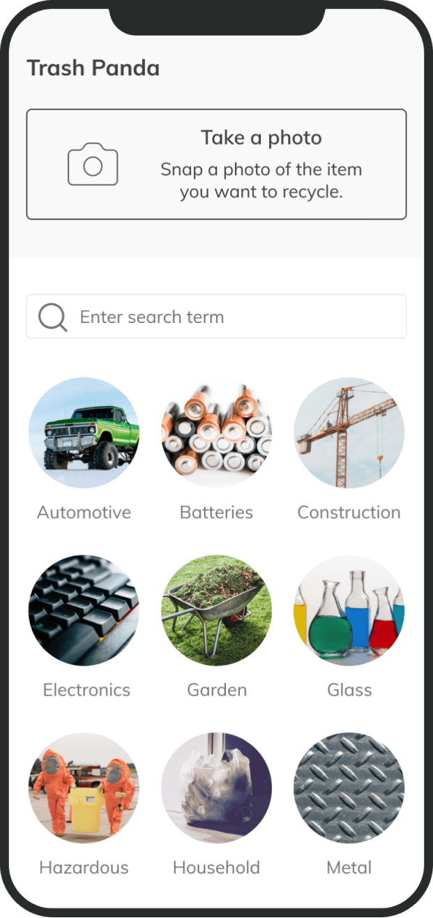
We started not knowing whether we should showcase the image recognition over category search. Right away we knew we wanted to create a simplistic design, so we progressed into giving the user all 3 options on the landing page. You can see that more clearly in the final designs below.
Category Search Flow Progression


For category search, we wanted to remove any friction the user might encounter. We considered whether the user would prefer actual photos or icons to describe an item or material.From user testing, we learned that users more easily recognize photos of items over icons. We realized we would have to sacrifice some aesthetics to include photos of all 300 items in the database, but it was something we did not regret doing in the end.
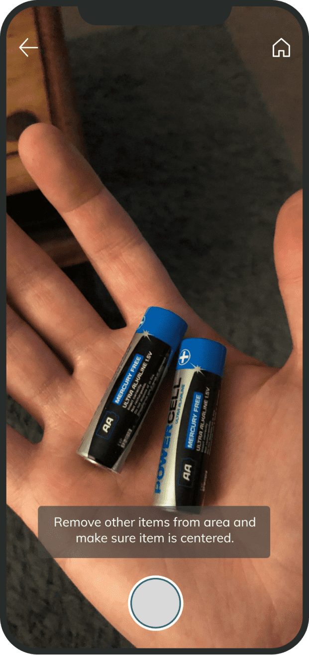
Camera & Results Progression


We wanted to make this flow as simple as possible: take a picture, get a result. This was where we had to collaborate closely with the data science team. We weren’t sure if their image recognition model would be able to take information from users to learn, or if the user took another picture that the results would be any different.
Navigation Progression


We went through several iterations trying to find a workable solution for navigation. The app was simple but still needed some flexibility.
Key Insights from usability testing
Users were delighted by the image recognition feature.
It was incredible to see users actually having fun with a recycling app. Although the average accuracy hovered at 55% for all items, users were impressed each time our model recognized an item correctly.
Users love being able to visually identify items during category search.
We chose photos over icons due to this discovery. While icons would have created a more cohesive design, users have an easier time identifying actual items in photos. We optimized for speed of discovery.
Users want more information at their fingertips.
We received a lot of positive feedback that this product would help people create better recycling habits. However, they wanted even more information regarding what the material is, why it may be hard to recycle, who is coming up with new procedures to improve the recyclability of certain items, etc.
Final Designs
Getting permissions without adding a lot of friction


With the camera feature, users can identify recyclables quickly and easily


Providing the option to search by category helped engage more users


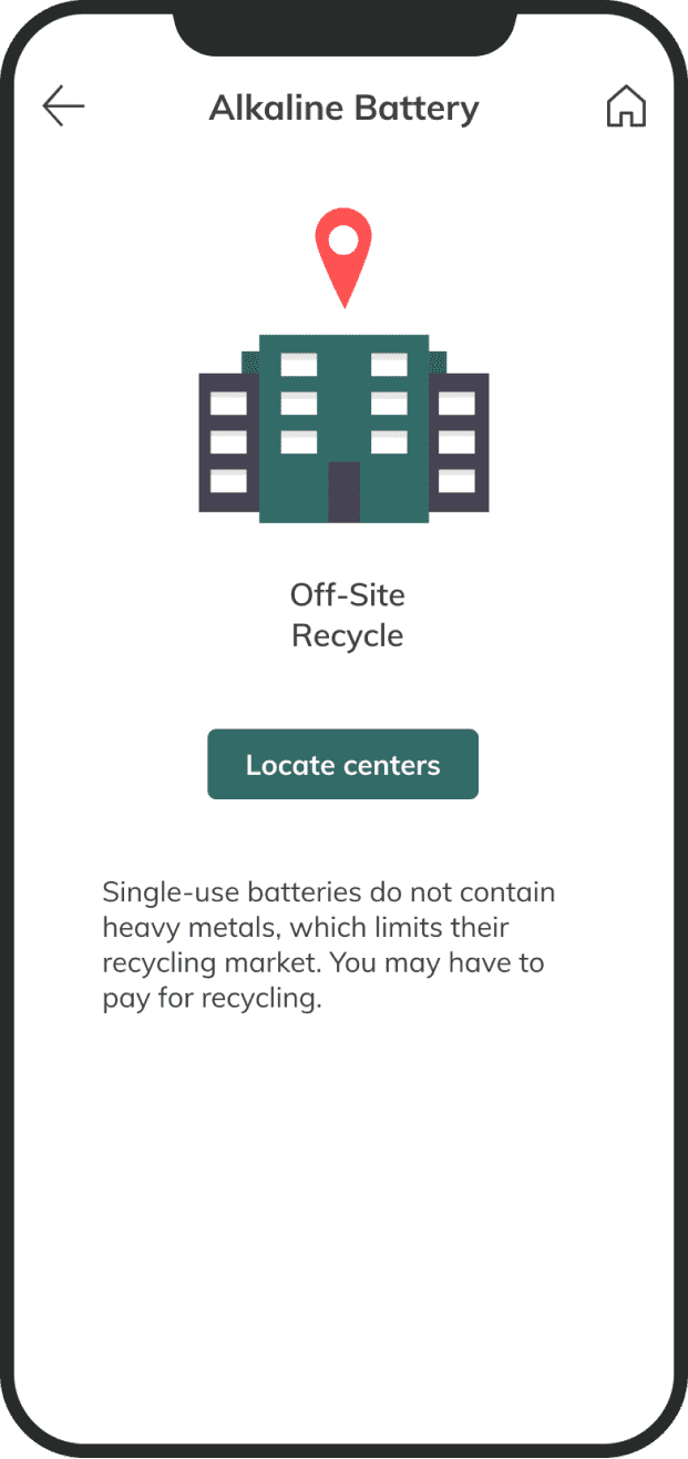
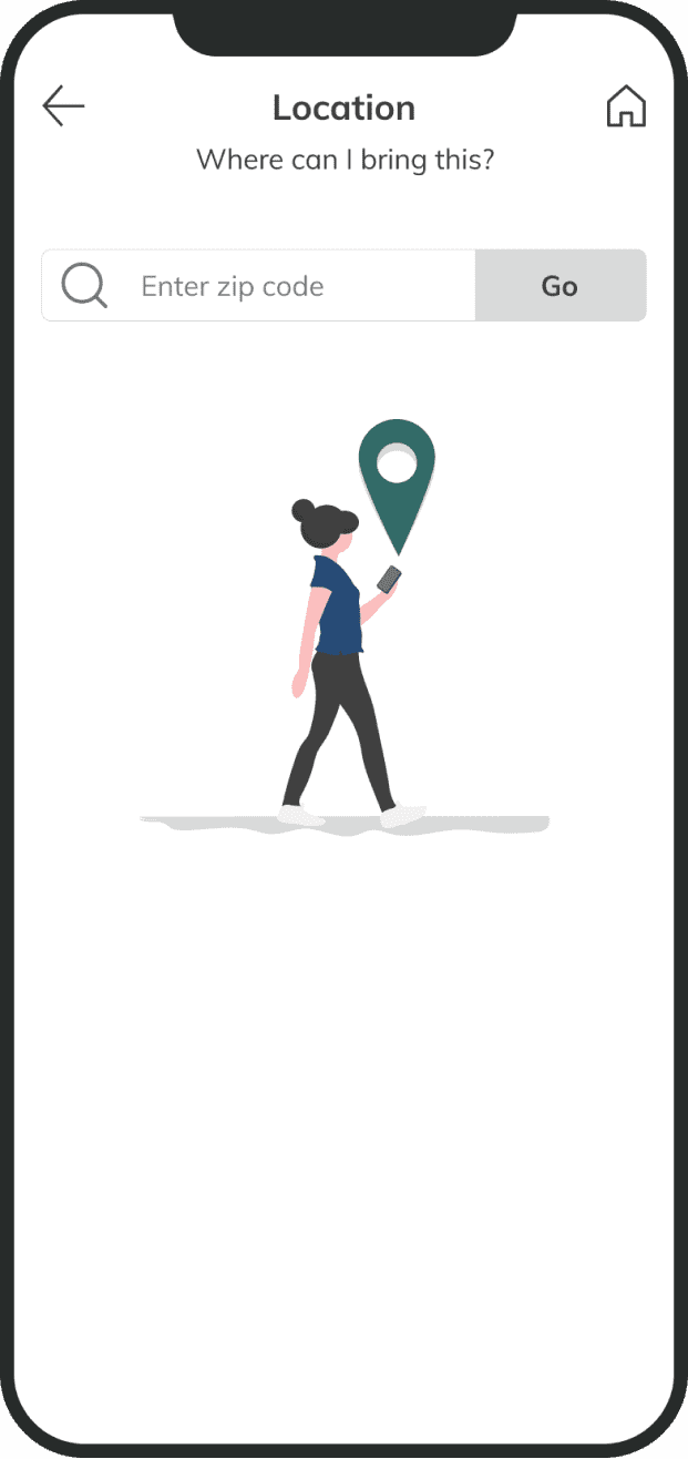
Each results page was designed to feature the most valuable info to the user


What I Learned…
I was extraordinarily lucky to have had a team of people that were great collaborators. Between the data science team, the frontend and backend developers, and my design partner, progression through the iterations was seamless.
Collaboration between disciplines.
I am still amazed at the amount of work that we all put in to create something we’re proud of. The experience of collaborating with different skill sets helped me to contextualize my own developing UX skills. I became well-adapted to not only explaining the reasoning behind my design decisions, but also interpreting the explanations I was receiving from the others.
Understanding limitations.
I learned early on how important it is to understand the limitations of data and web development. At times, it can seem like the components we are designing work like magic. We, as designers, had to listen to the team to figure out what was possible and then use that information to mold our designs.
The importance of the user.
The major lesson I learned throughout this experience was how important it is to make decisions based on data. Testing each iteration and each idea with users was absolutely essential. Everybody has an opinion but the one that matters most comes from the person who will be using the service.