Trash Panda
Point your camera at trash. Learn what to do with it.
Project details
- We had 8 weeks to deliver a fully functional product
- The team included 2 designers, 4 data science partners, 4 developers, and 1 PM
- Provided with a Product Vision to expand
Problem space
People don’t recycle enough to make an impact on our local and global ecology.
Solution to explore
Make recycling accessible to everyone.
Using research to refine how we can help
We anchored on Earth911 early. Their API covers, for any item in any ZIP code, whether it gets recycled, how, and who takes it. Everything else could build on that.
Data we could expect from Earth911
- Specific item descriptions. Items included plastic bottles, engine parts, household cleaners, etc.
- Location-based information on how each item is disposed of or recycled in that area.
- Location-based information on specific disposal facilities that accept the item in question.
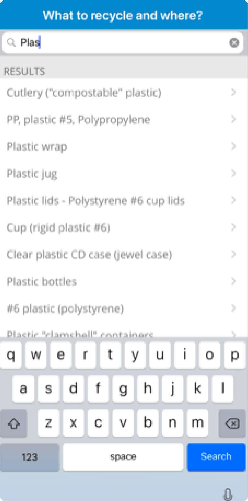
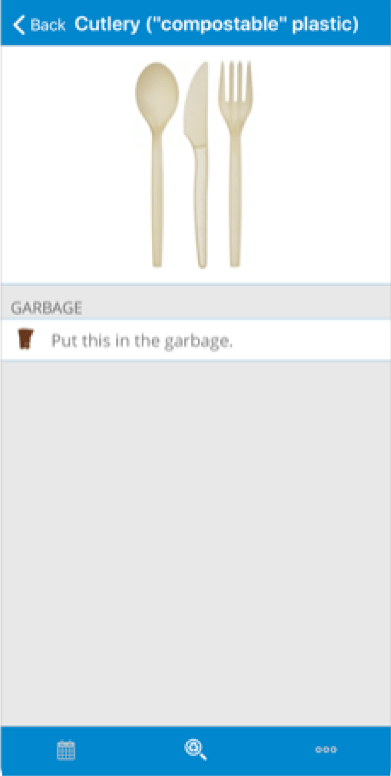
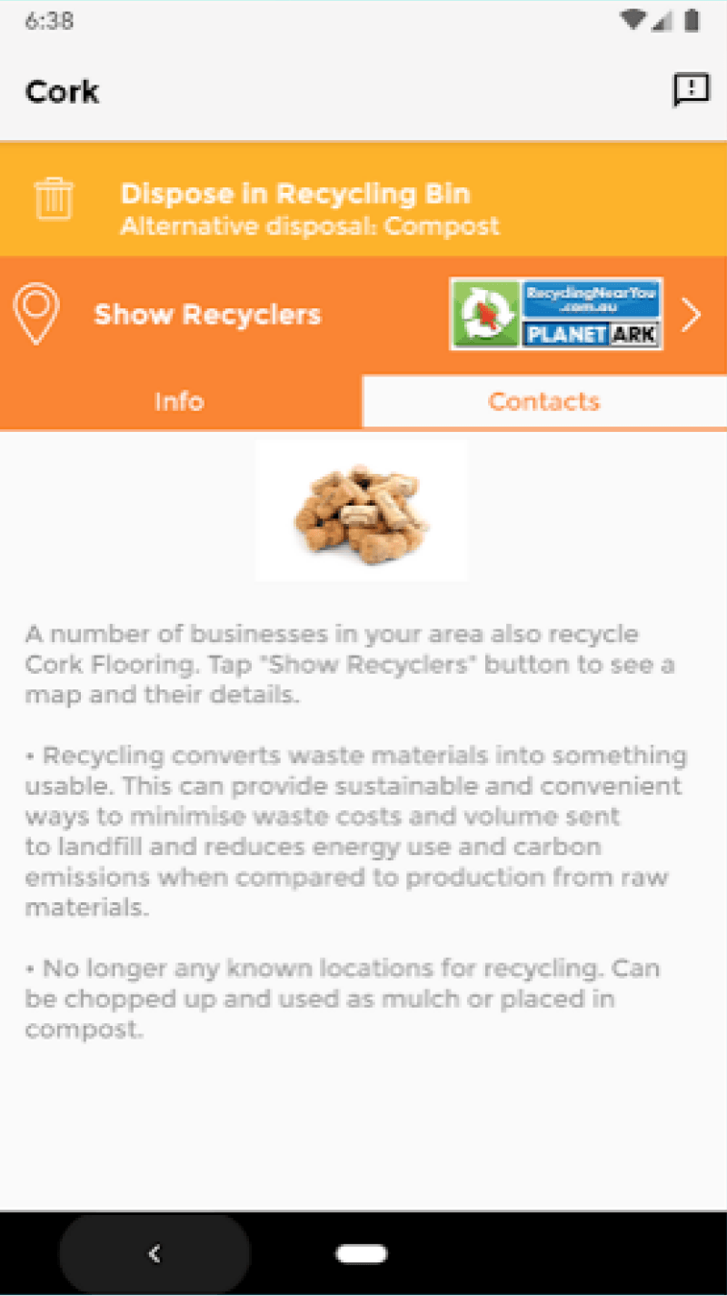
Analyzing the current competition
The existing tools had the data and buried it: cluttered, unexplained, years out of date. Good information, hard to want.
What could we build that promotes recycling?
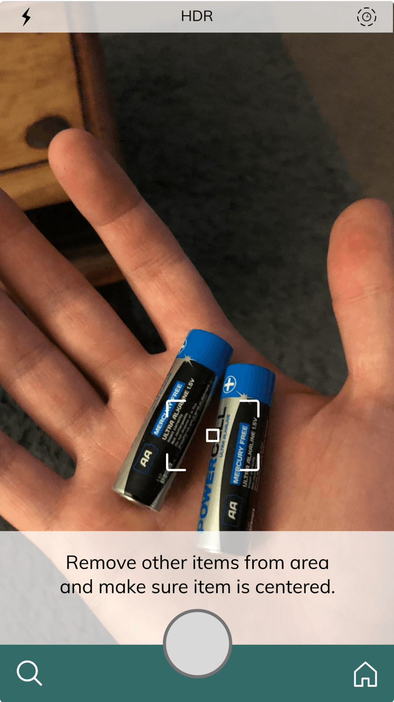
We wanted the phone to do the work: point the camera at the thing in your hand, and let the app say what it is and where it goes.
Key insights from user interviews
Any amount of inaccuracy in the image recognition causes a significant amount of distrust.
5 of the 6 people we spoke to would not use the product if image recognition accuracy fell below 80%.
Motivation to recycle is present, yet people are hard-pressed to change their habits.
People want to recycle. They don’t want to study for it.
Users will need reliable fallbacks in lieu of perfect image recognition
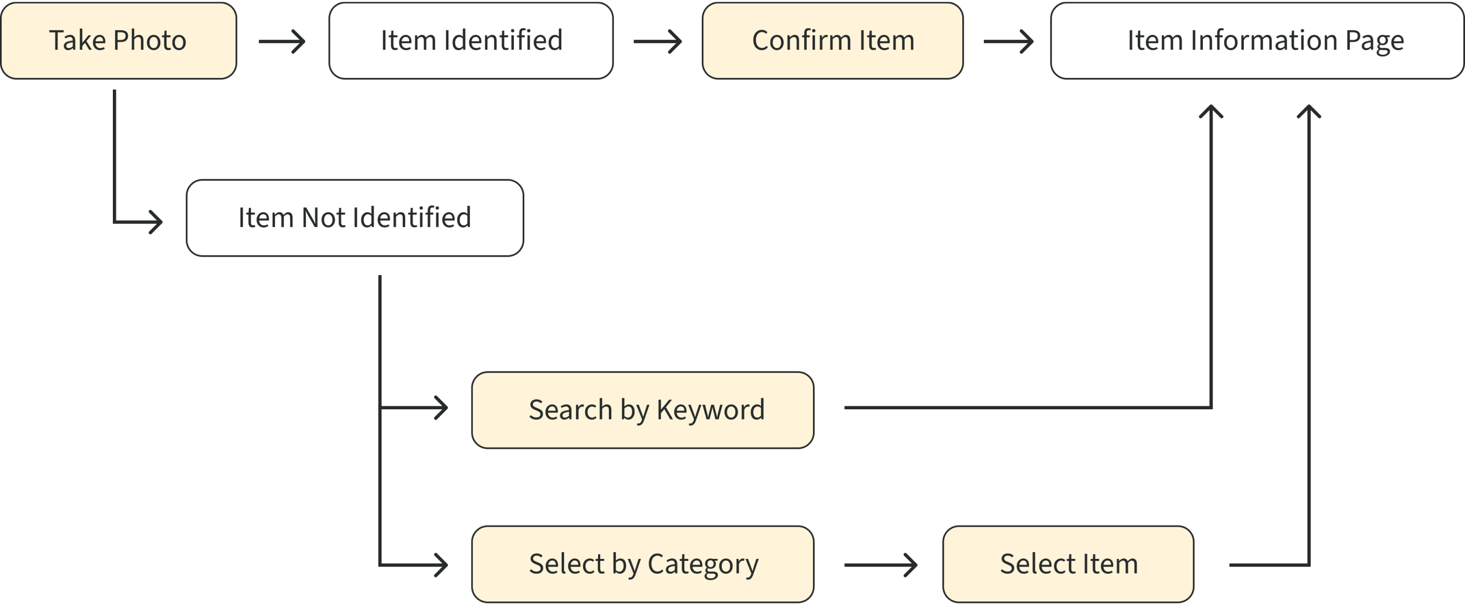
So we designed for the miss: camera first, keyword and category search right behind it. Whatever the route, you’re never more than 3 taps from an answer.
Continuously asking what works
This was my first time pair-designing. We disagreed often, and with 8 weeks on the clock we couldn’t afford to stay stuck, so we made rules for disagreeing.
We both learned some important lessons during our collaboration
- When you deadlock, split up. An hour designing alone, then reconvene and take the best of both drafts.
- Every decision needs a user-experience reason. “I like it” isn’t one.
- Be kind, take breaks. If you can’t see your partner’s reasoning, ask before you veto.
Home page progression
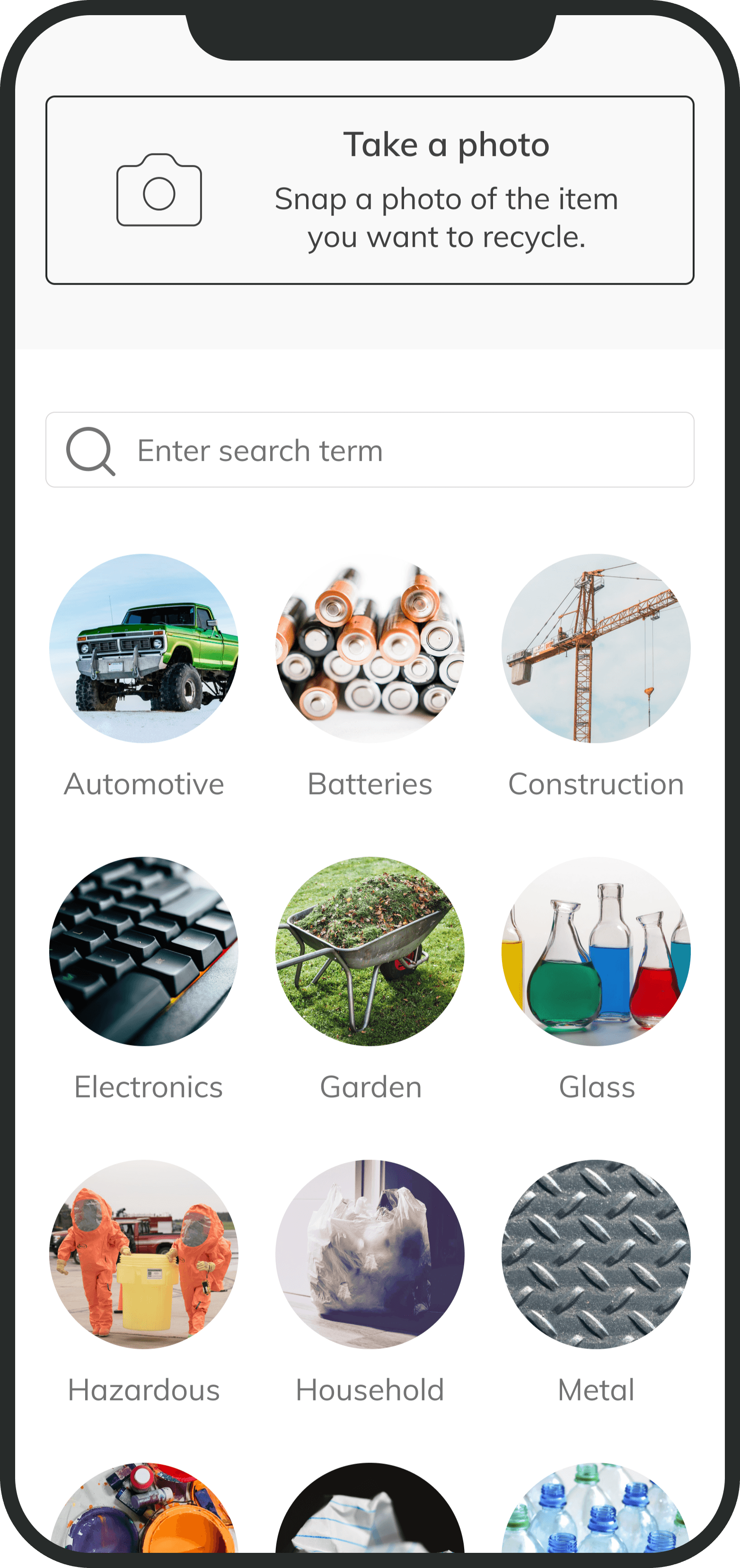
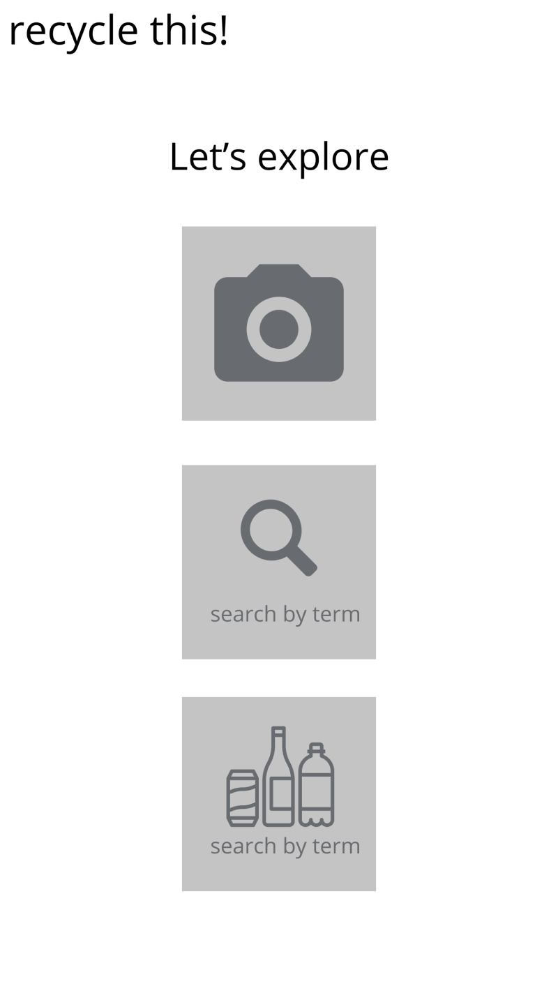
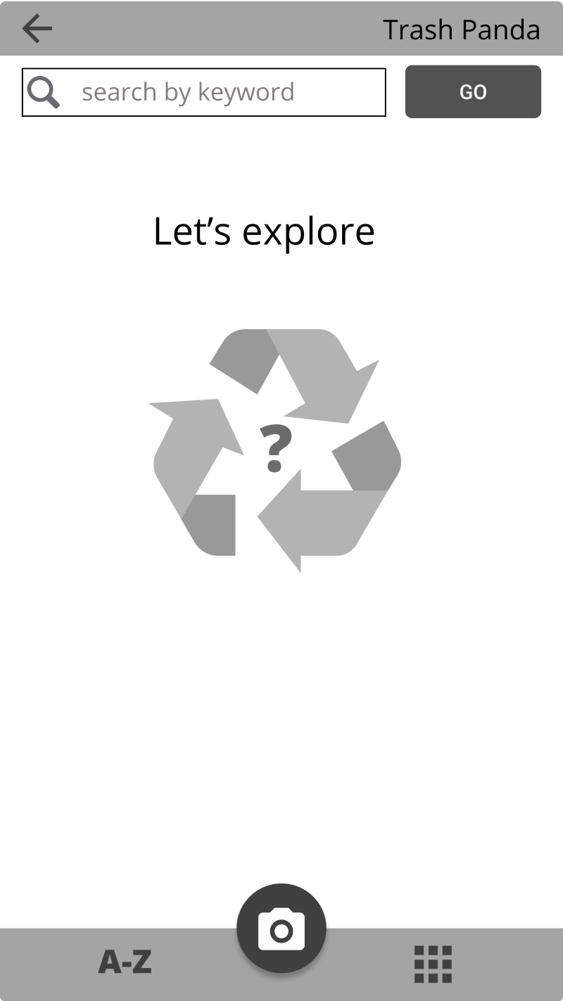
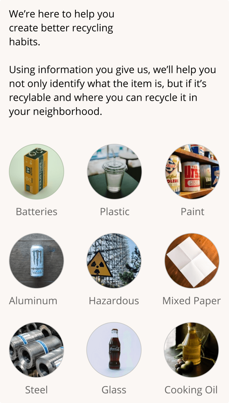
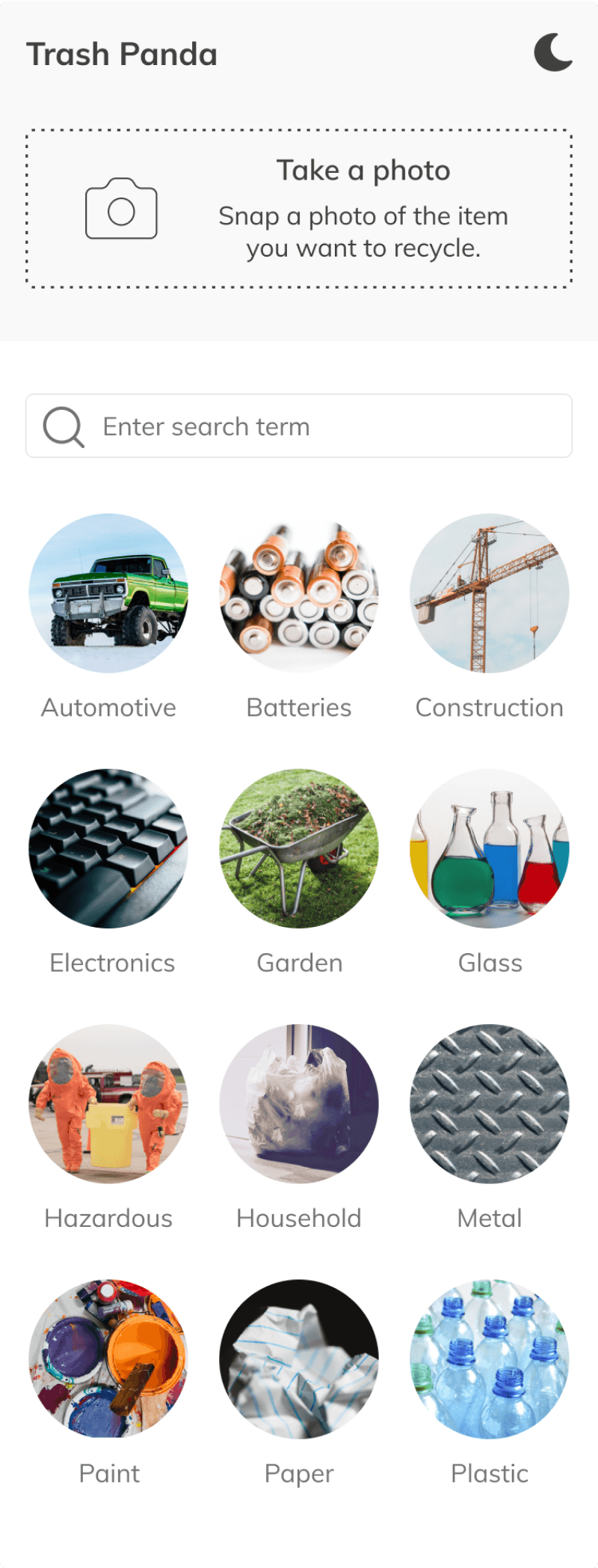
We started unsure whether to lead with image recognition or category search. The answer was neither: keep the page spare and offer all 3 paths, camera, keyword, and category. The final designs below show where that landed.
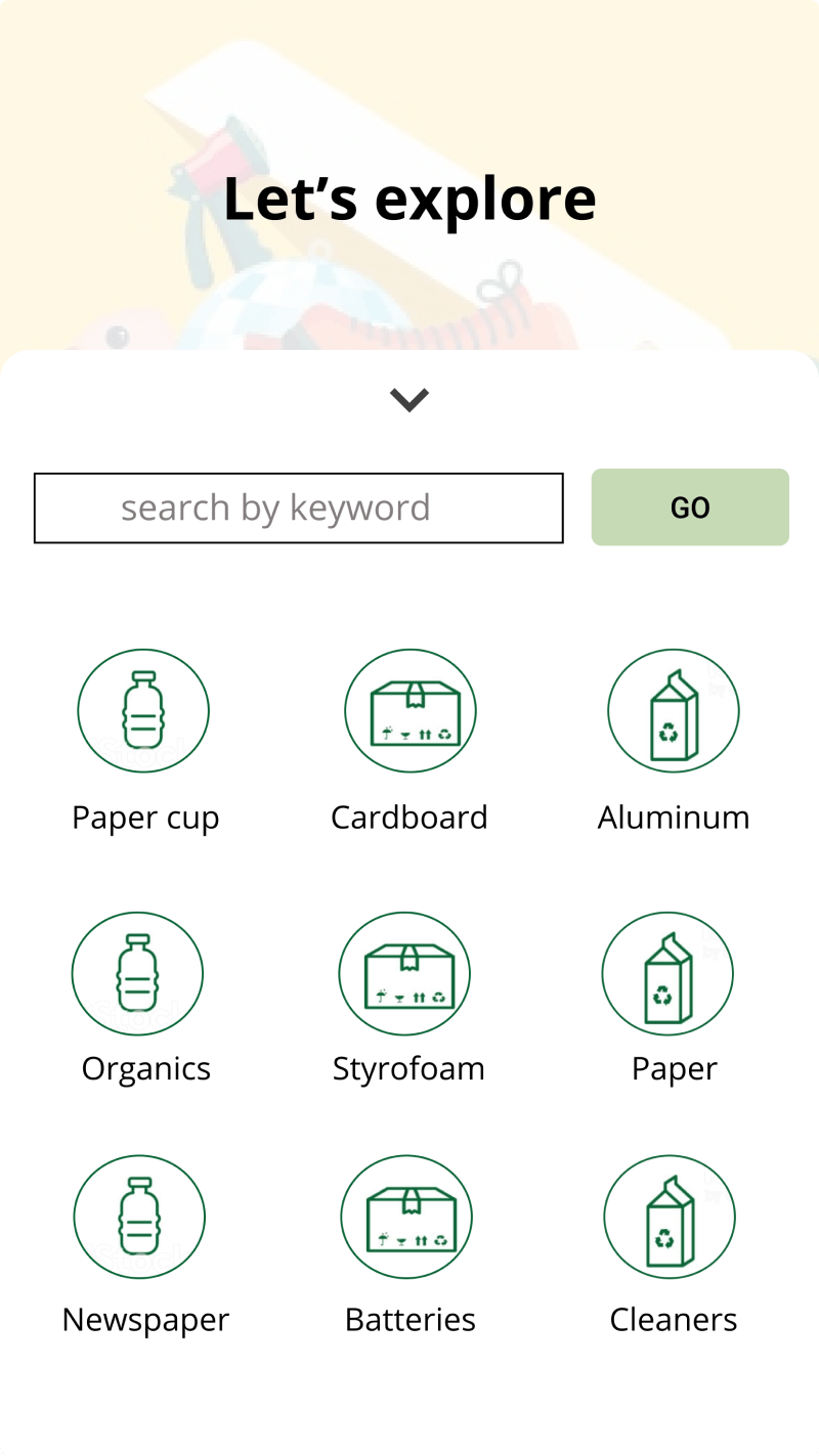
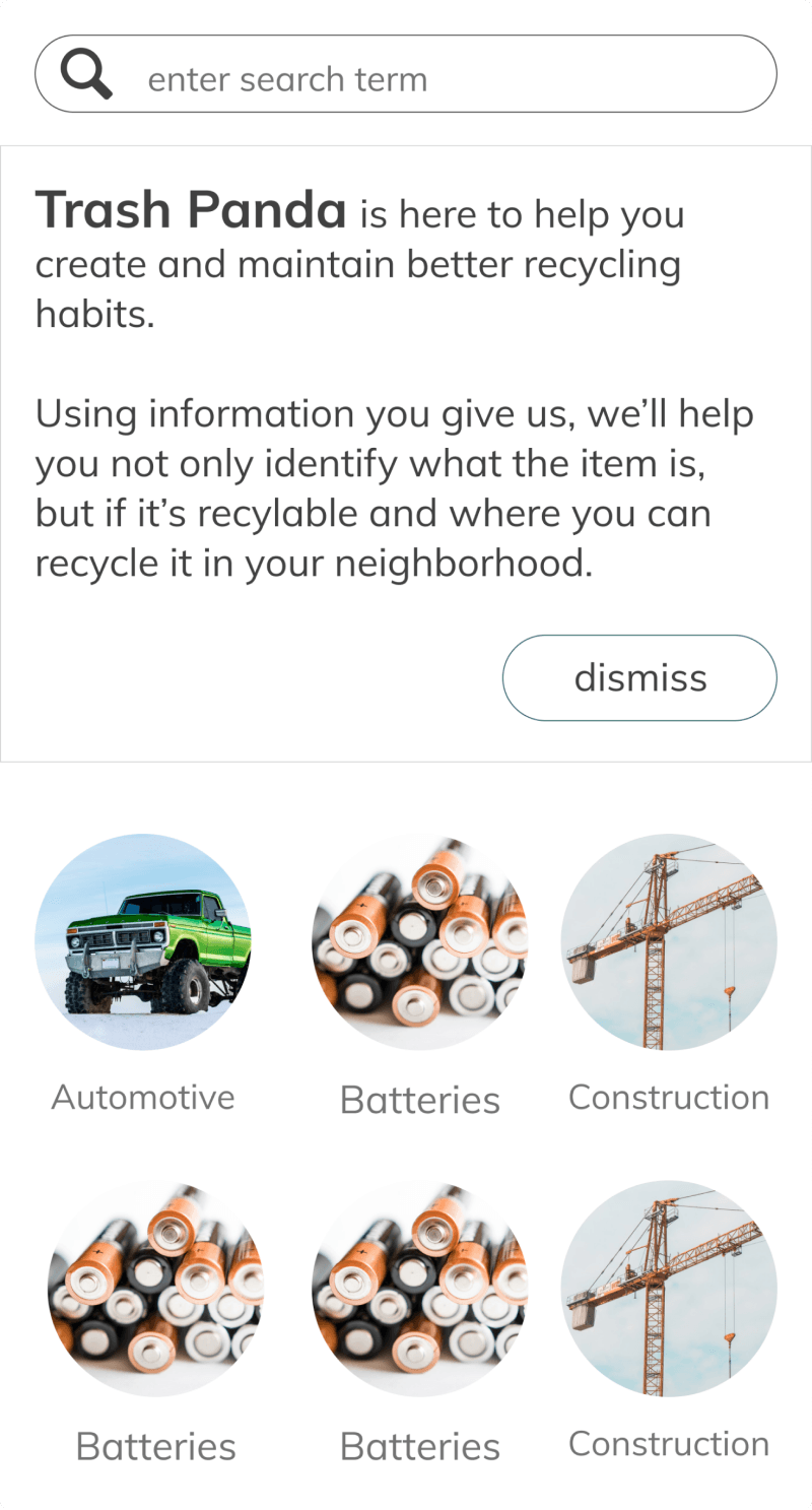
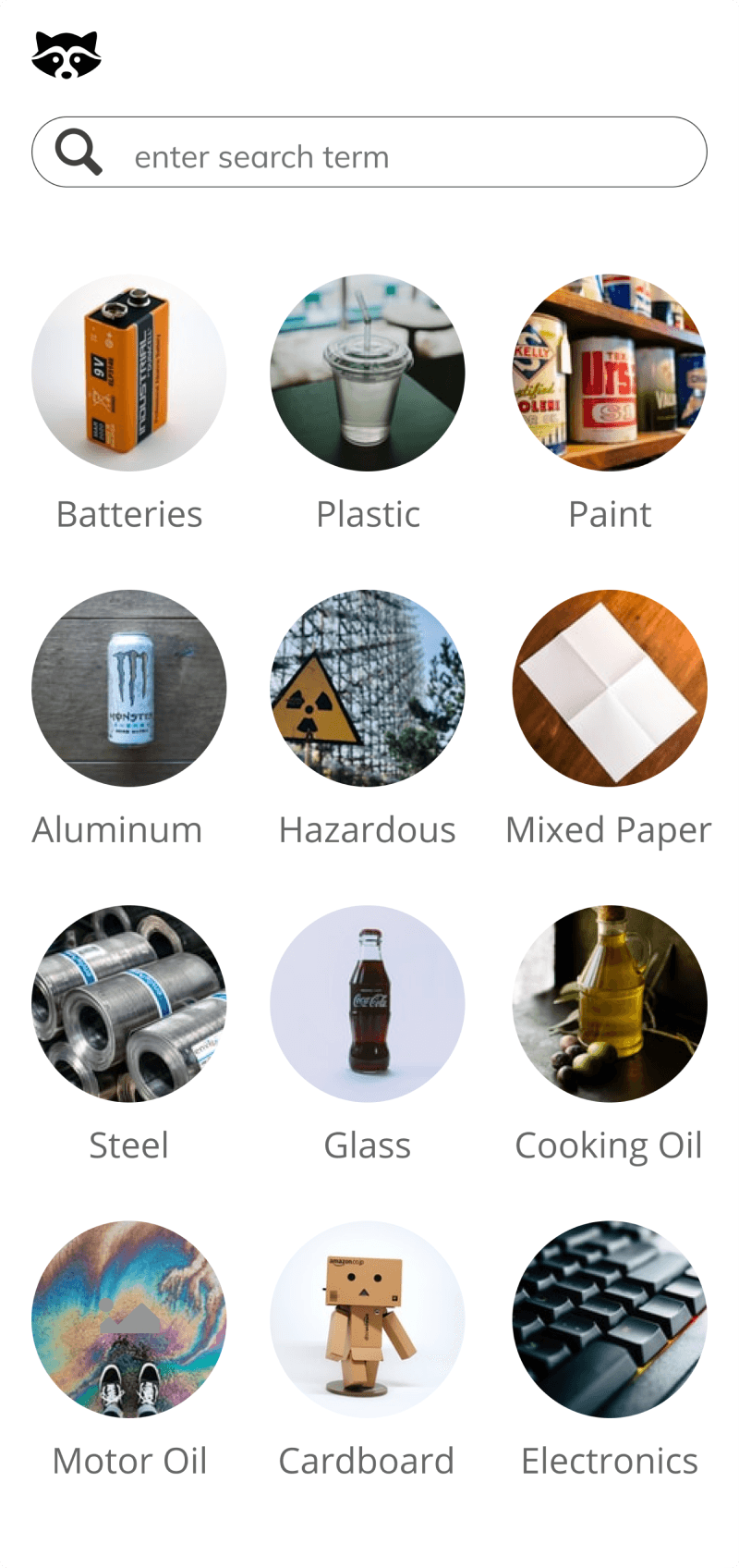
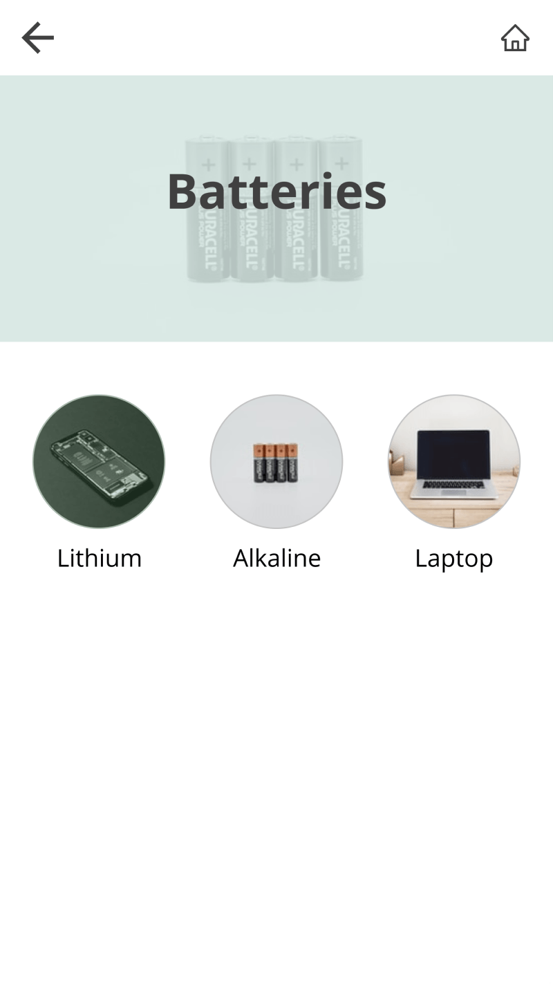
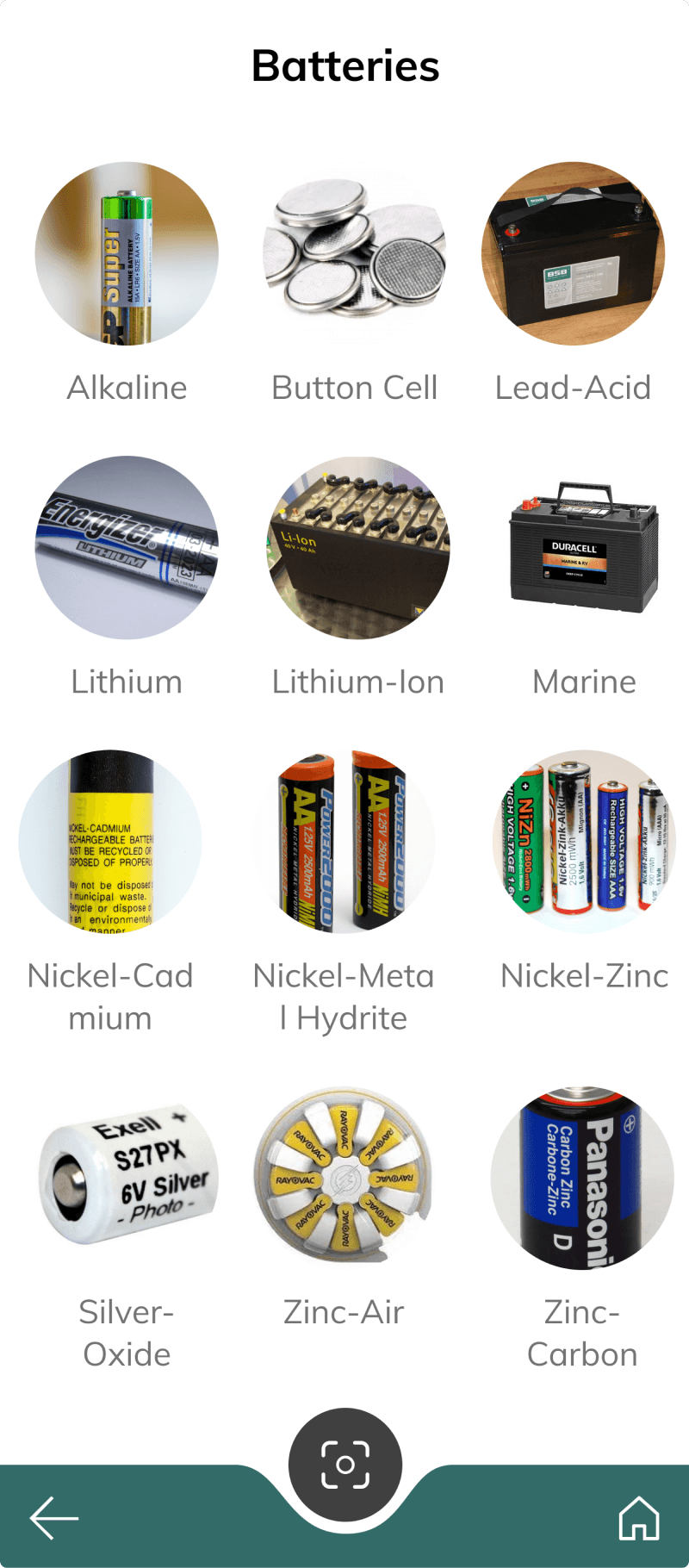
Changes to the category search flow
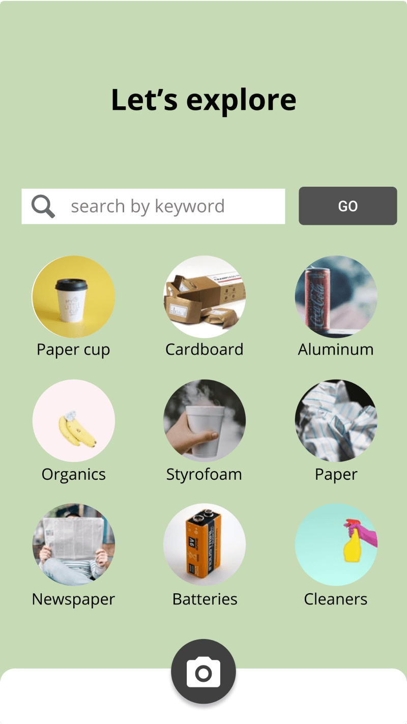
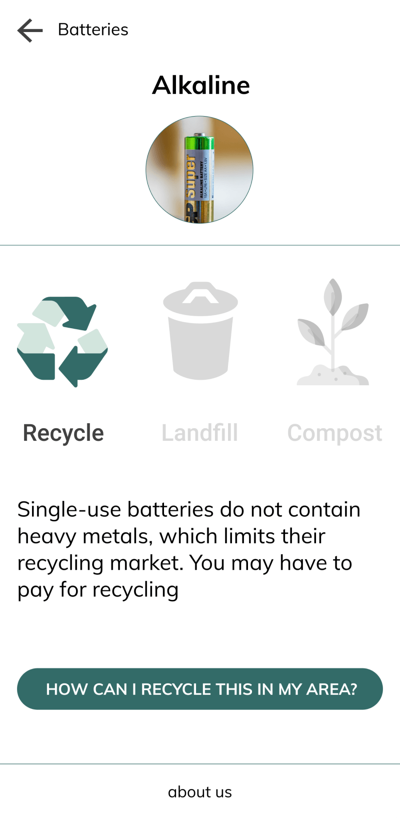
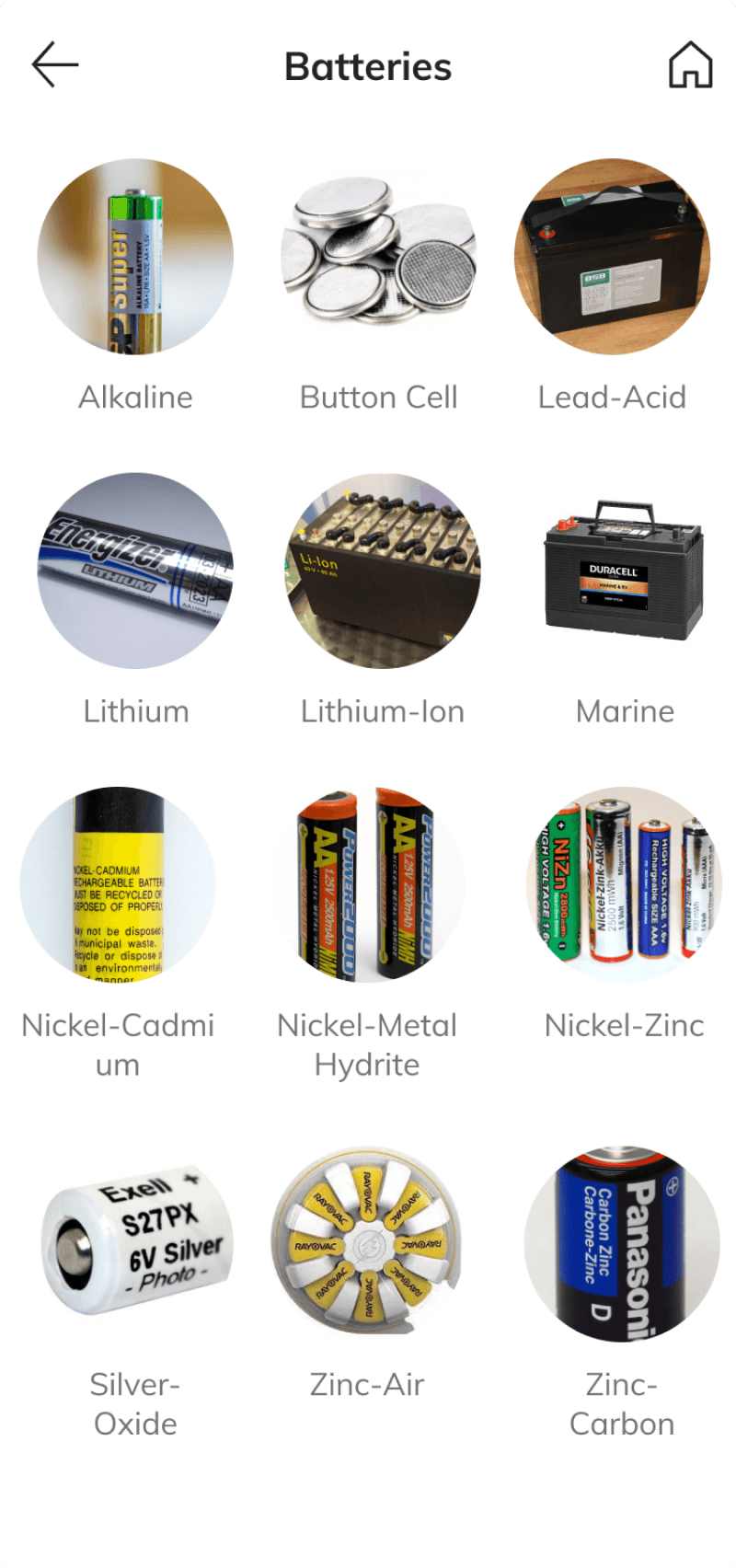
The open question was photos versus icons for items and materials. Testing settled it: people recognize a photo of a battery faster than a battery icon.
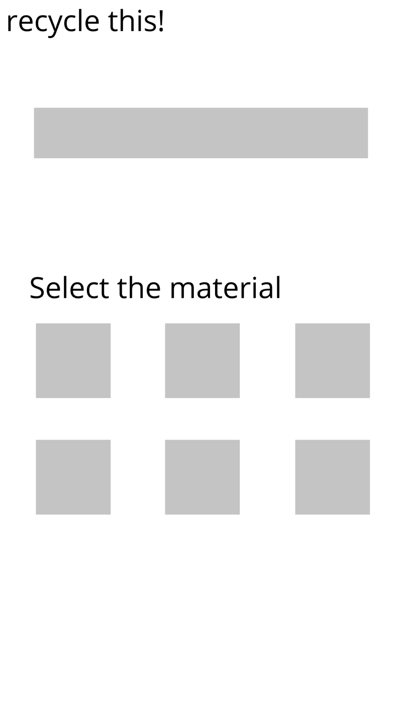
Progression of camera & results
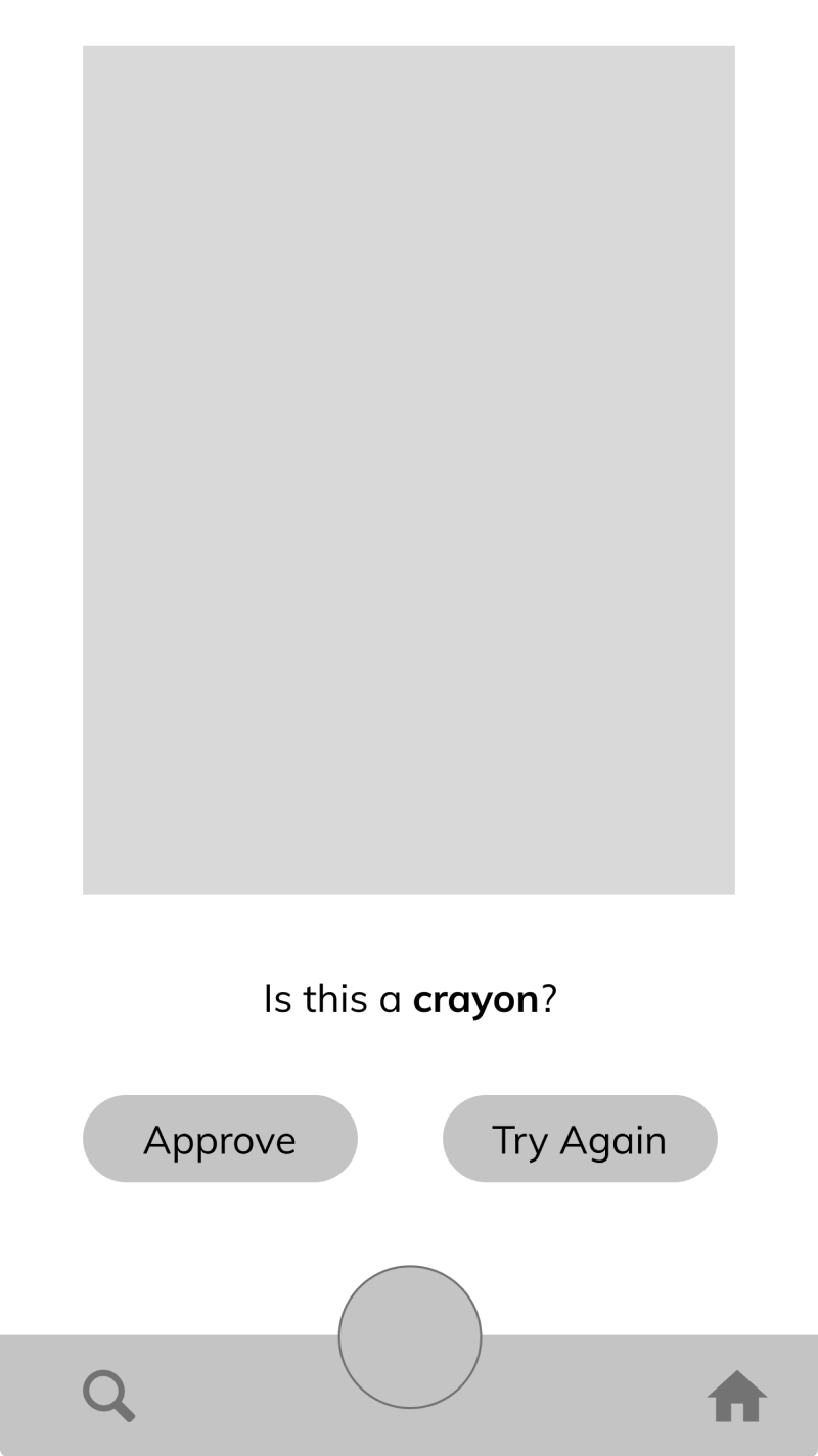
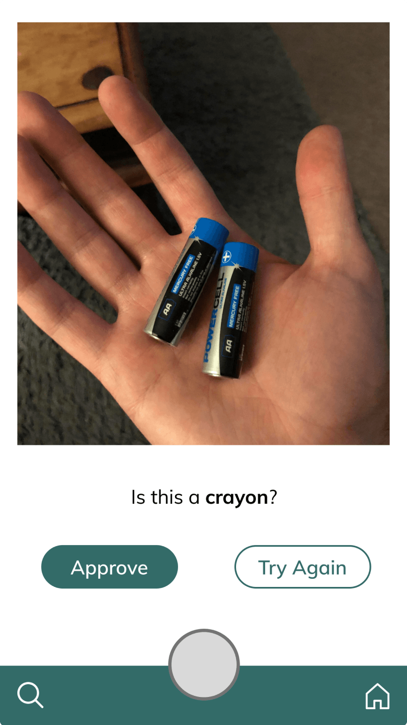
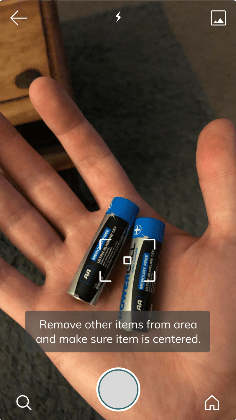
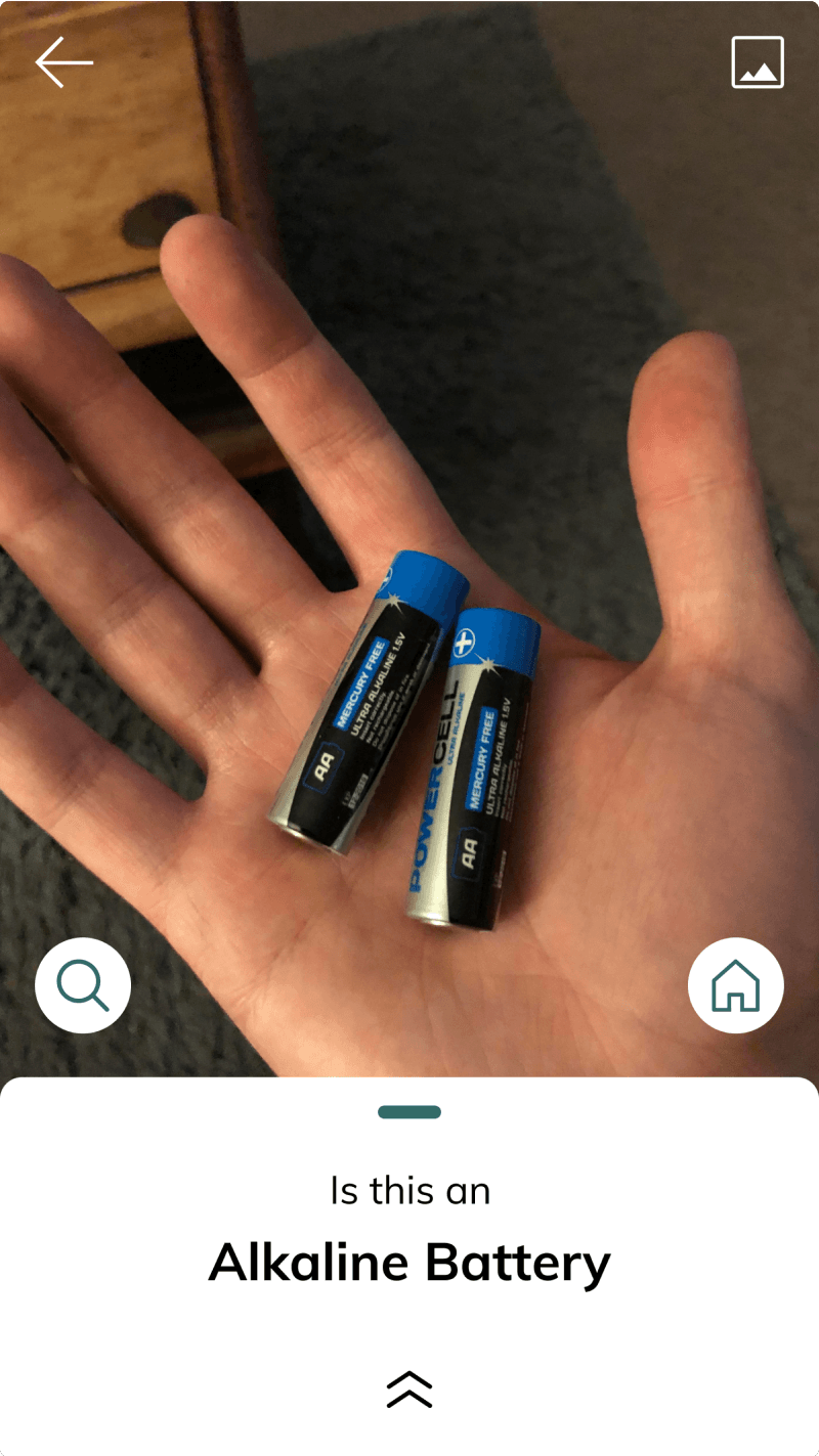
The flow stayed simple (take a picture, get a result) but it took close work with the data science team. We couldn’t promise the model would learn from corrections, or that a retake would change the verdict. The design had to be honest about what the model didn’t know.

Navigating through navigation styles
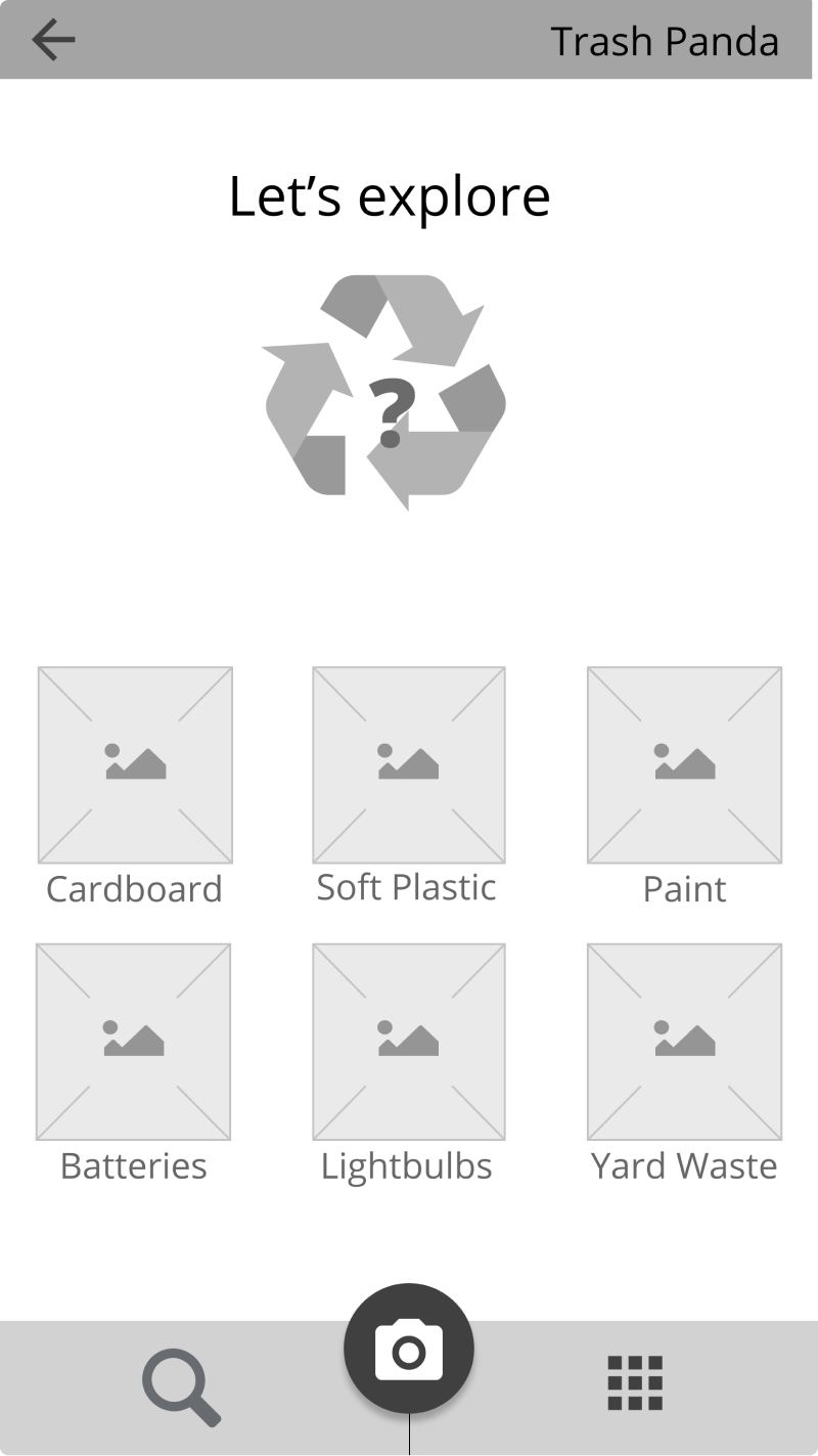
Three destinations, one requirement: the camera reachable from anywhere, without thought. It took several tries.
Key insights from usability testing
Users were delighted by the image recognition feature.
Average accuracy was 55%, and people were still impressed every time the model got one right. Nobody expects much from their trash.
Users love being able to visually identify items during category search.
Icons would have been more cohesive; photos were faster. We chose speed.
Users want more information at their fingertips.
People asked for more: what the material is, why it resists recycling, who’s working on that. One good answer creates appetite for the next.
Final designs
We shipped a working app. It stayed downloadable for years, until support wound down.
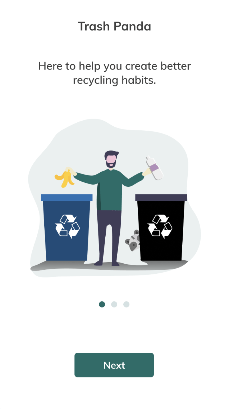
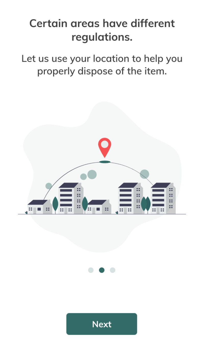
Getting permissions without friction
Onboarding needed location and camera access. Each screen explains what the permission buys before asking for it.
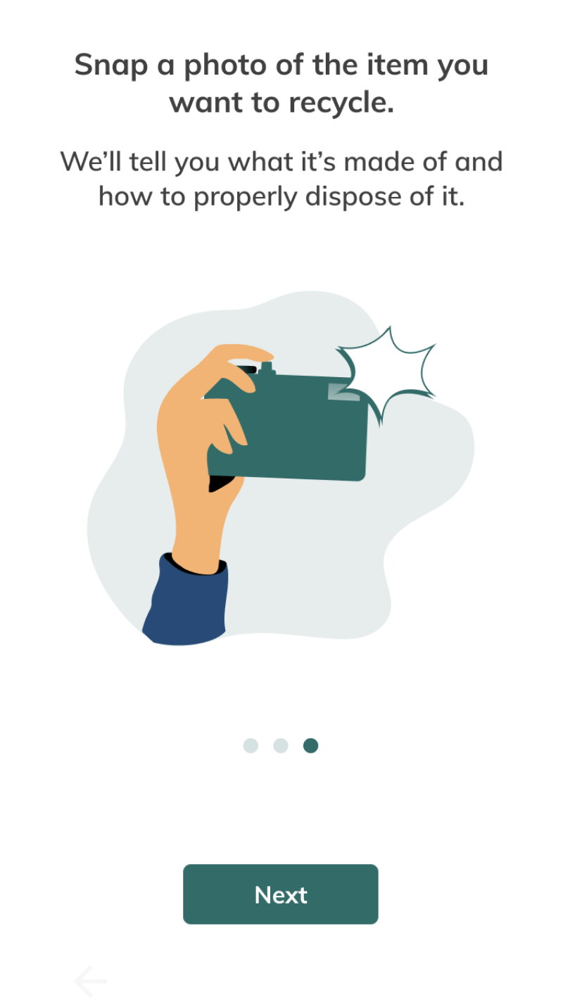
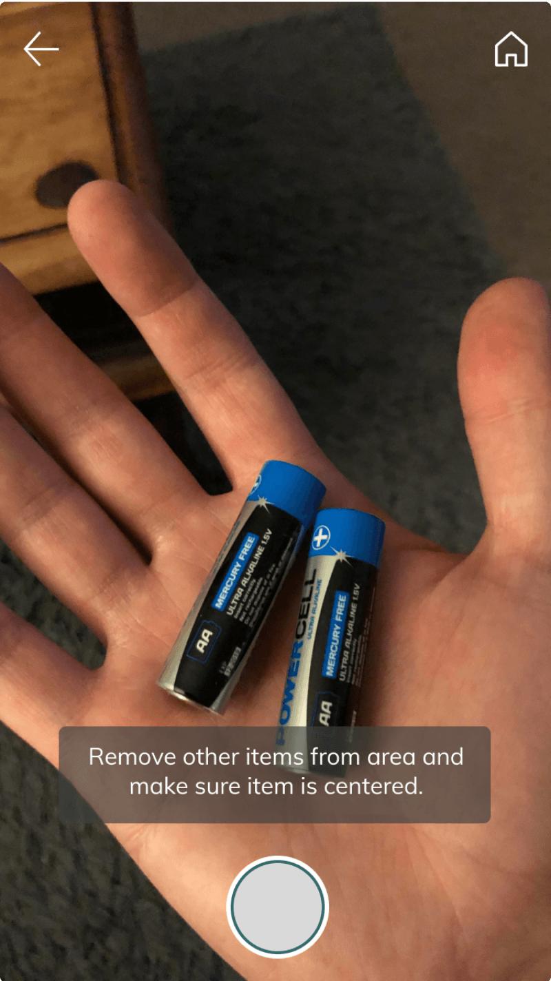
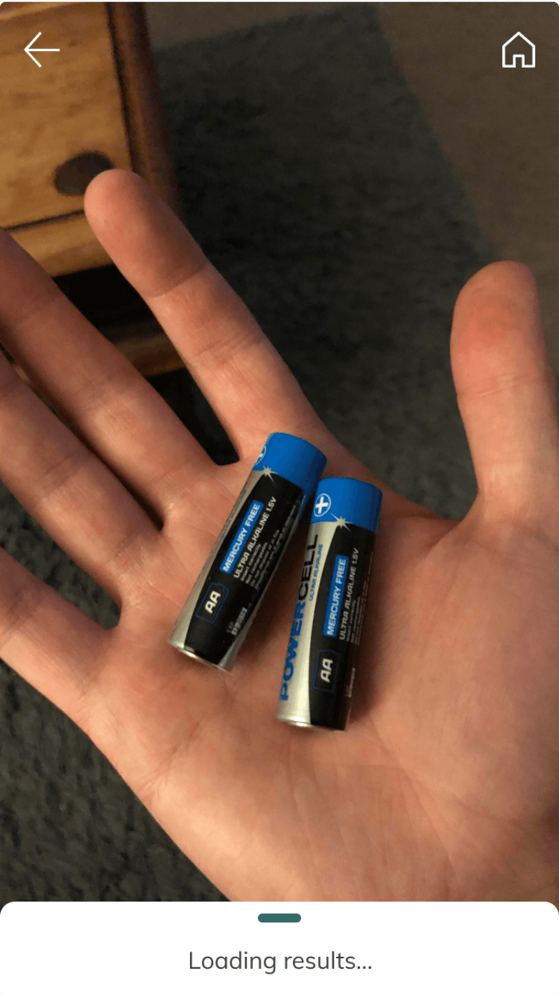
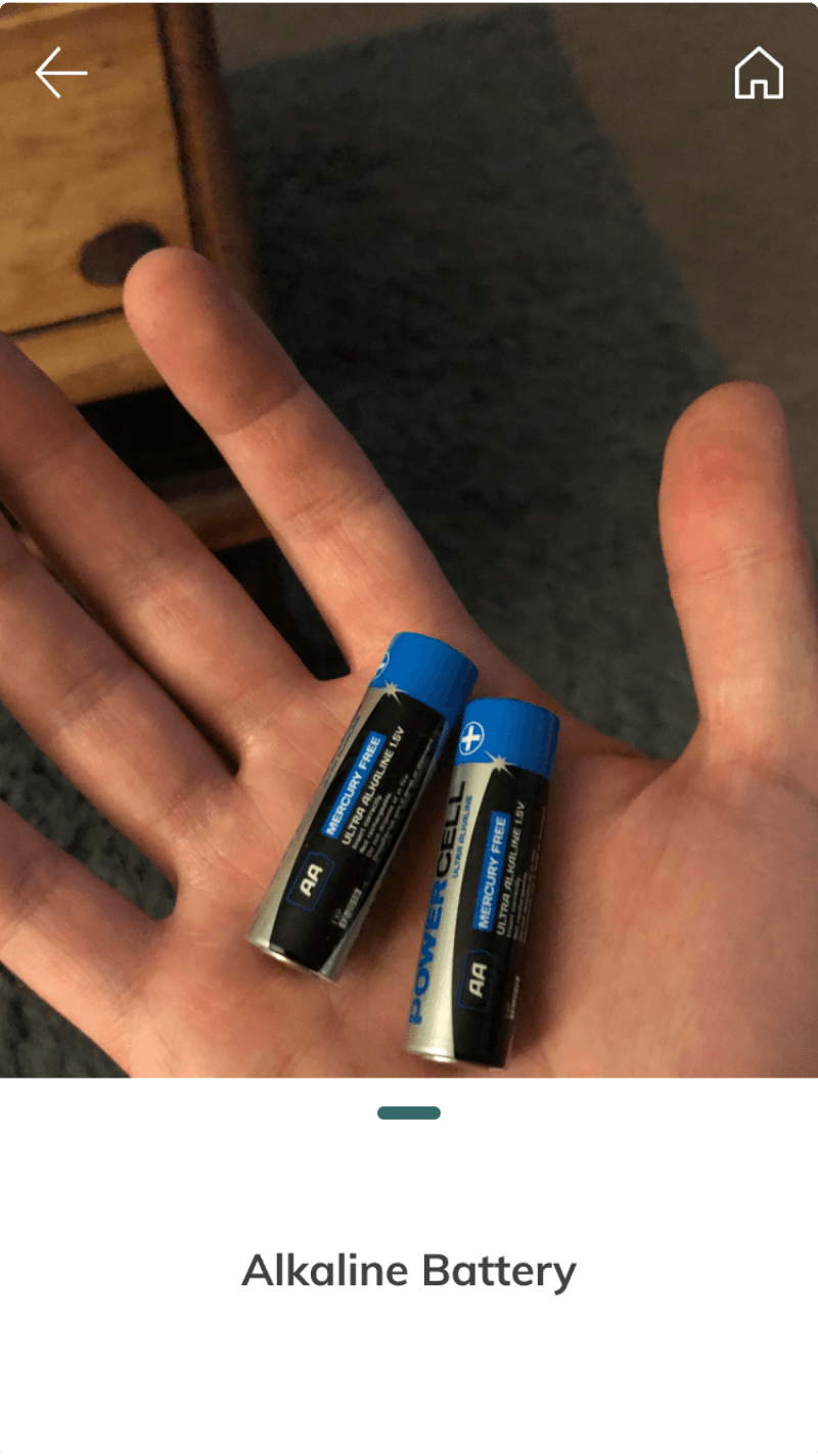
A camera feature that helps users identify recyclables
After processing, the result slides up as a card: minimal, legible, tappable for the full detail.
Category search helps engage more users
The photos carried this flow. Users said so, unprompted.
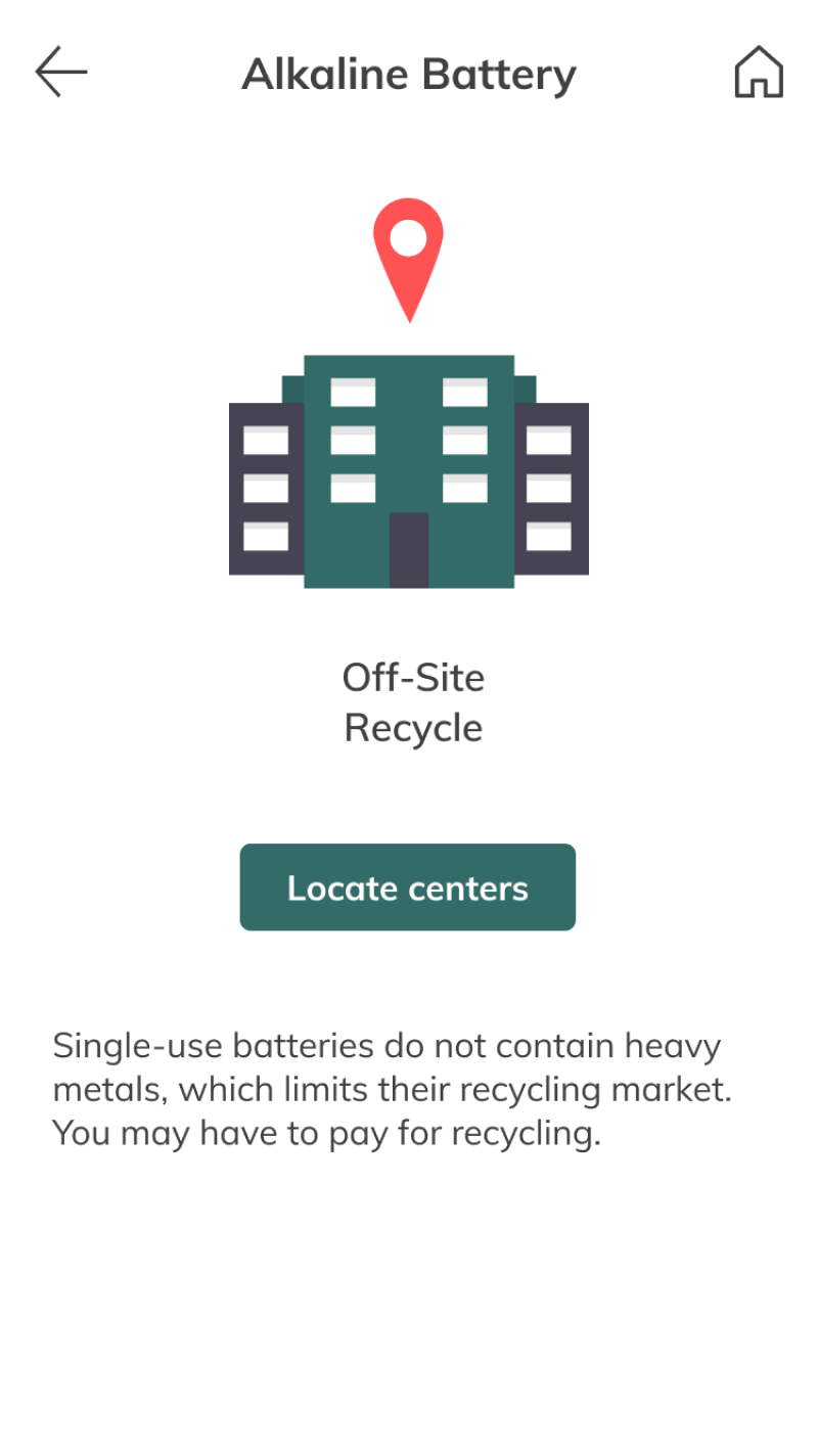
Item information pages with proper visual hierarchy
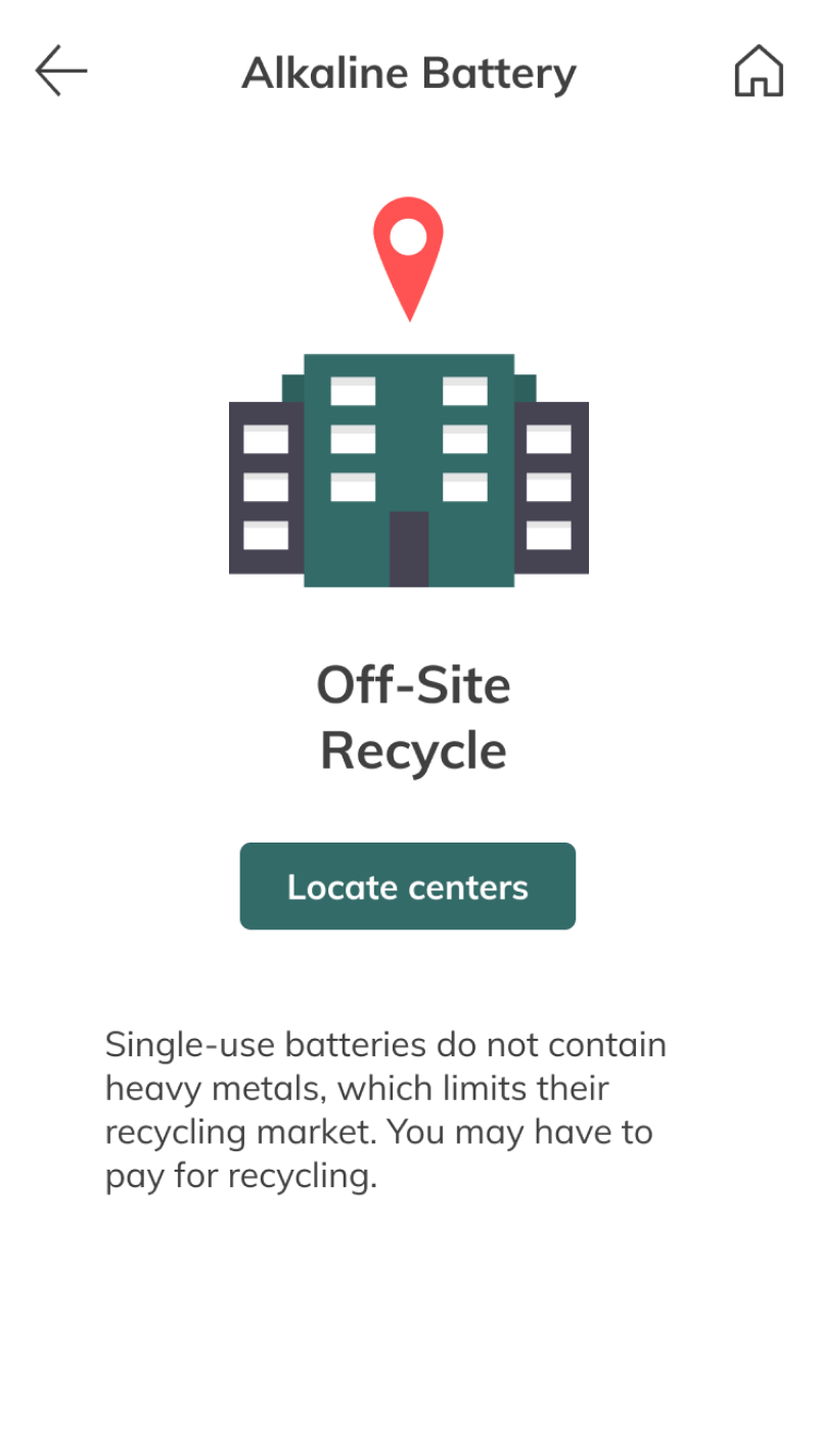
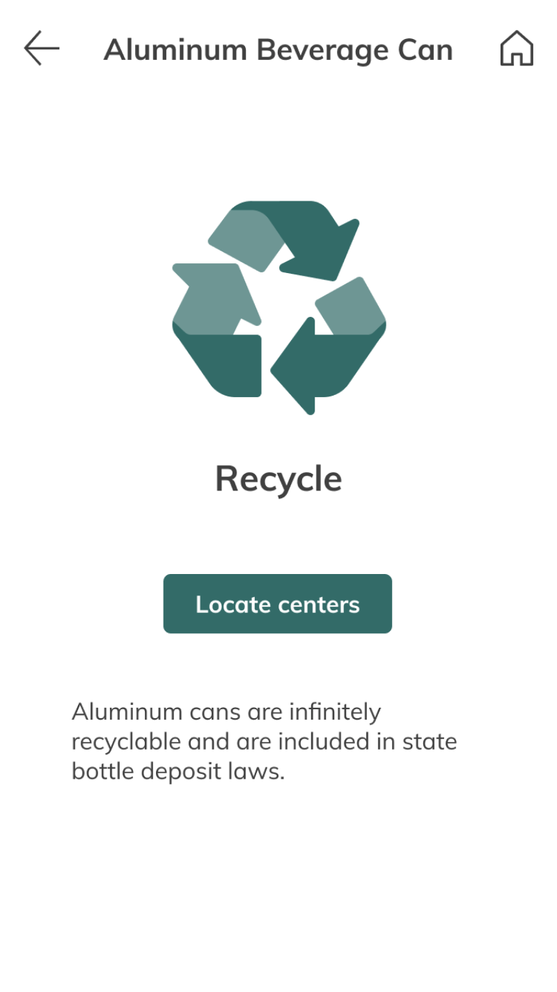
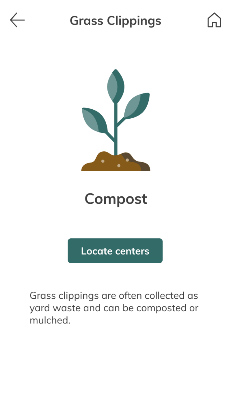
Each item page answers two questions at a glance: what is this, and what do I do with it. The single call to action, locate a recycling center, is the point of the app, so nothing competes with it.
What I learned…
This was my first real collaboration across disciplines. Three lessons stuck.
Collaboration between disciplines
Working alongside data science and engineering taught me to explain design reasoning in terms others can act on, and to translate their constraints back into design. Fluency in both directions is the job.
Understanding limitations
Designs look like magic until someone has to build them. The model wasn’t going to hit 80% because we wished it would. The discipline was listening to what was actually possible, then designing to that.
The importance of the user
Decide from data. Every test moved the design somewhere instinct wouldn’t have taken it. Everybody has an opinion; the person holding the trash has the one that counts.