Plant Parenthood
Track what each plant needs. Keep it alive.
Problem space
People love plants, and still let them die.
Solution to explore
Track each plant’s needs, so survival doesn’t depend on memory.
Project details
- I was given 2 weeks for discovery & ideation
- My team and I were allowed 1 week to develop & ship the MVP
- The team included 1 UI developer, 3 React developers, and 1 backend developer
Do people actually want their plants to thrive?
The right first question: a plant-care app is only worth building if the answer is complicated. So before designing anything, I asked.
Questions I asked potential users
- If your plant dies, what do you do? How do you feel?
- How long do you tend to keep your plants alive?
- Do you know the specific species of your plants?
- What’s the hardest thing about owning plants?
Key insights from user interviews
Plant owners care for their plants based on intuition rather than knowledge.
2 of the 3 people I spoke to never looked up how to care for their plants. Trial and error, mostly error.
There is not a big incentive to making sure your plants stay alive.
Everyone said the same thing: if a plant dies, buy another. No guilt, a $12 replacement. So the app couldn’t run on obligation. It had to be easy and genuinely pleasant, or nothing.
Building something for people who want plants
The interviews left three design problems.
The obstacle of actual work
People would keep more plants if plants were less work. The desire to care for living things is common; the appetite for chores is not.
What can the product carry so the person doesn’t have to?
Notification overload causes avoidance
Reminders read as help or as nagging, and people delete naggers without remorse.
How does a thriving plant stay worth the pings?
Poor communication causes confusion
Plants die by committee: watered twice on Monday, then not for three weeks, everyone assuming someone else had it.
Can one shared record fix what is really a household problem?
Designing within the product scope
The research pulled somewhere the project brief didn’t go. I trimmed the feature ideas that outgrew the scope, honored the brief, and let the learning shape what remained.
Getting creative with possible layouts
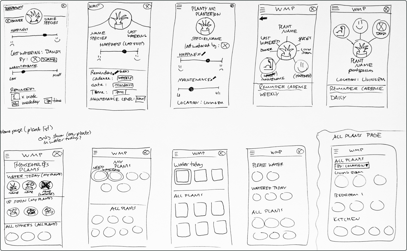
Fast, wide sketching first, something resembling crazy 8s. Cheap ideas before expensive ones.
Testing what kind of plant care people want
The project’s requirements
- Log in & sign up flow
- A list of all the user’s plants
- The plant profile
- The user profile
- Ability to set up watering reminders
Features the users wished for
- Smart reminders & scheduling
- A history of care for each plant
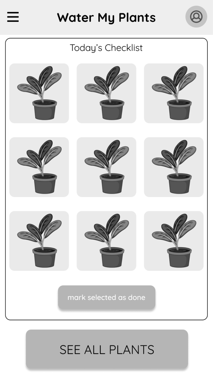
- Daily watering checklist
- Sharing tasks with roommates/family
- Assigning plants to a location
Getting insight into the user’s comfort zone
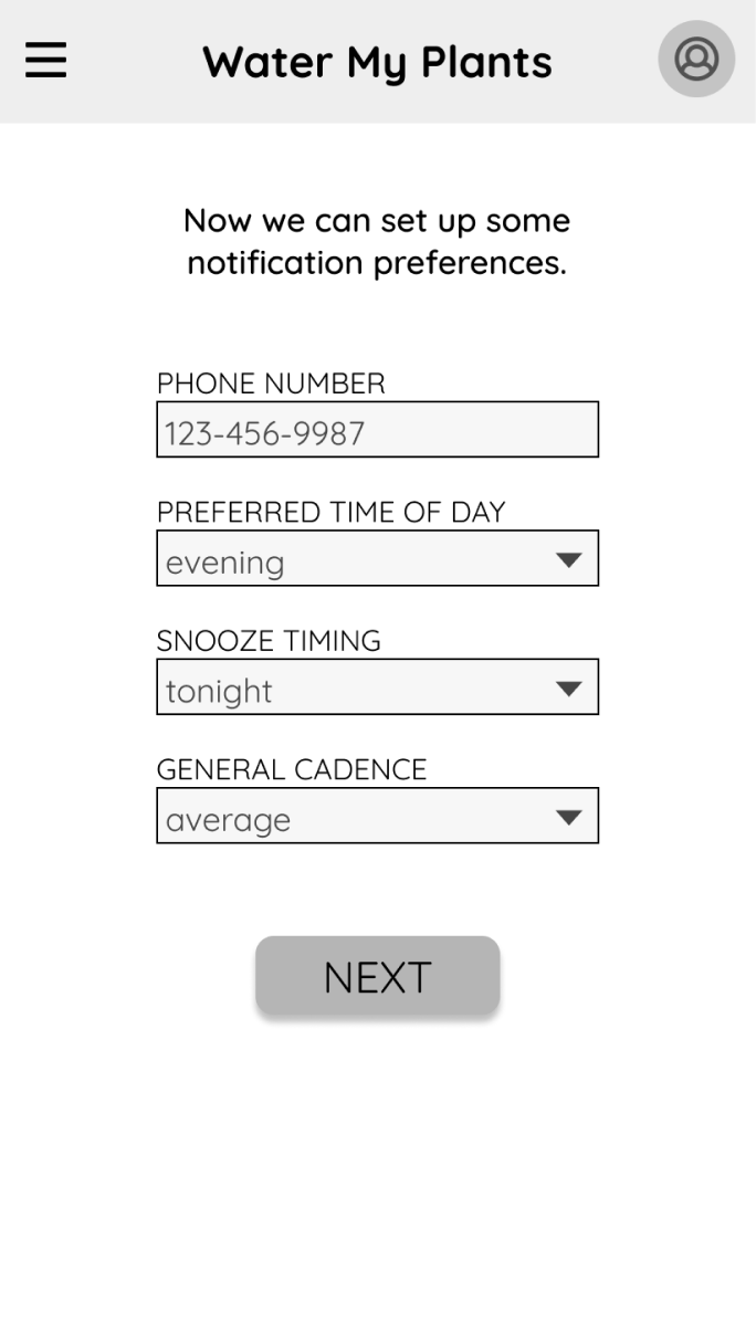
Low-fidelity testing had 3 questions. Does onboarding gather enough to avoid an empty home page? Does the home page lead with what people came for? Can users shape their preferences and their plants their own way?
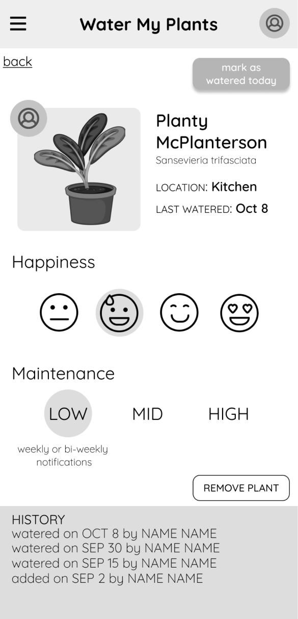
The changes I made due to my research
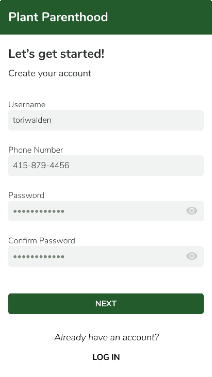
- The long mandatory onboarding process was shortened to the bare minimum of username, phone number, and password.
- I changed from using a bespoke warning color system to one more conventional with green indicating good and red indicating bad.
- I added descriptive confirmations so users would know when they successfully completed a task.
Final designs
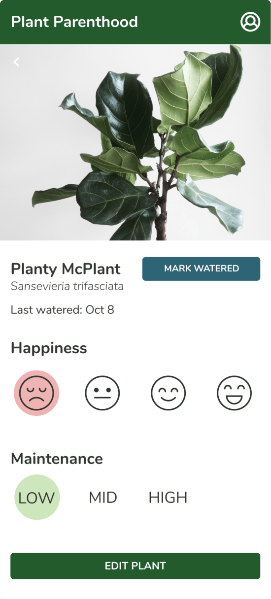
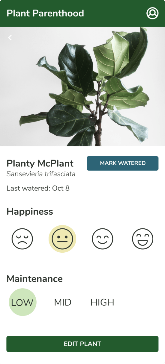
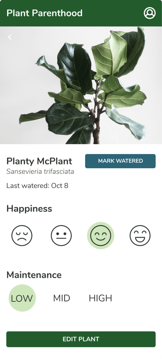
Showing relevant plant details in the plant profile
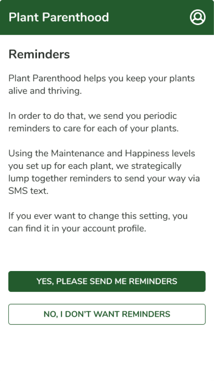
Each plant’s happiness and maintenance levels drive its notifications, so a reminder is about this plant’s needs, not a schedule.
Showcasing & adding plants
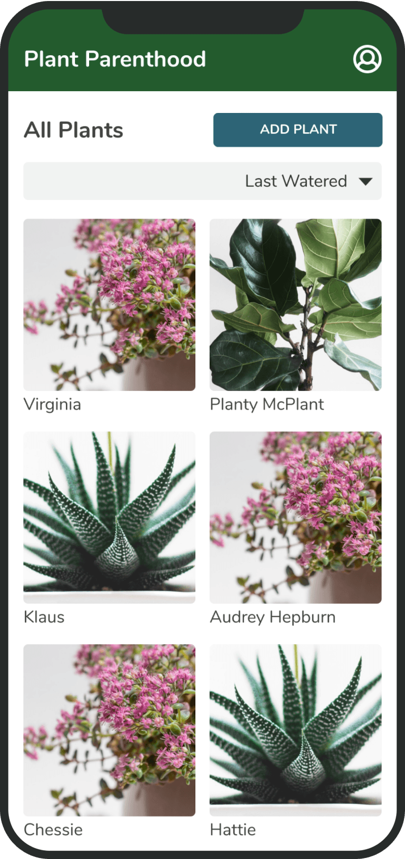
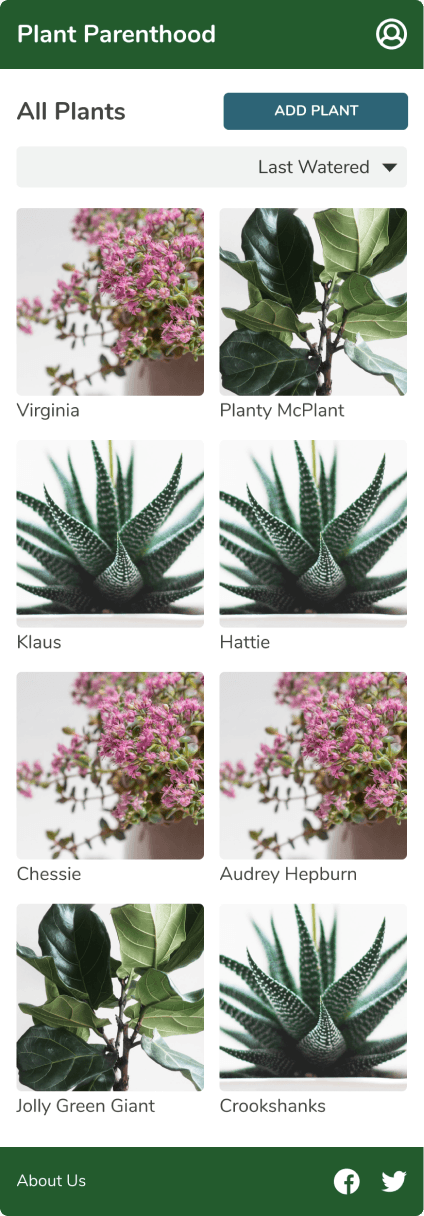
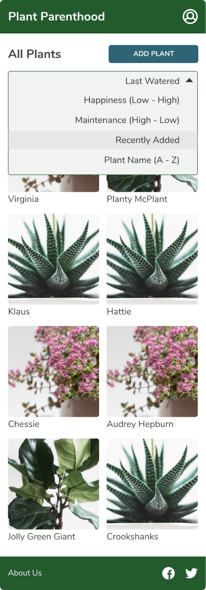
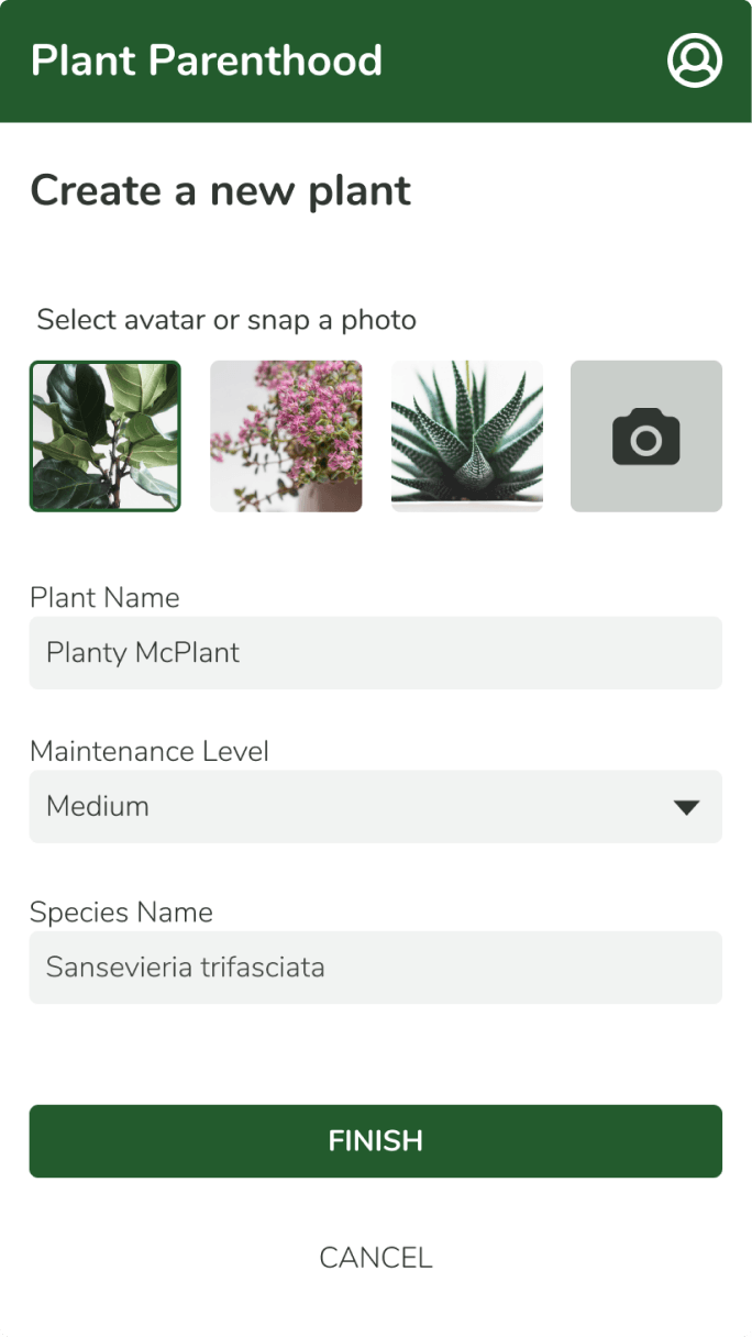
The home page is a photo grid, because plants are the point. Sorting (last watered, happiness, name) does the work underneath.
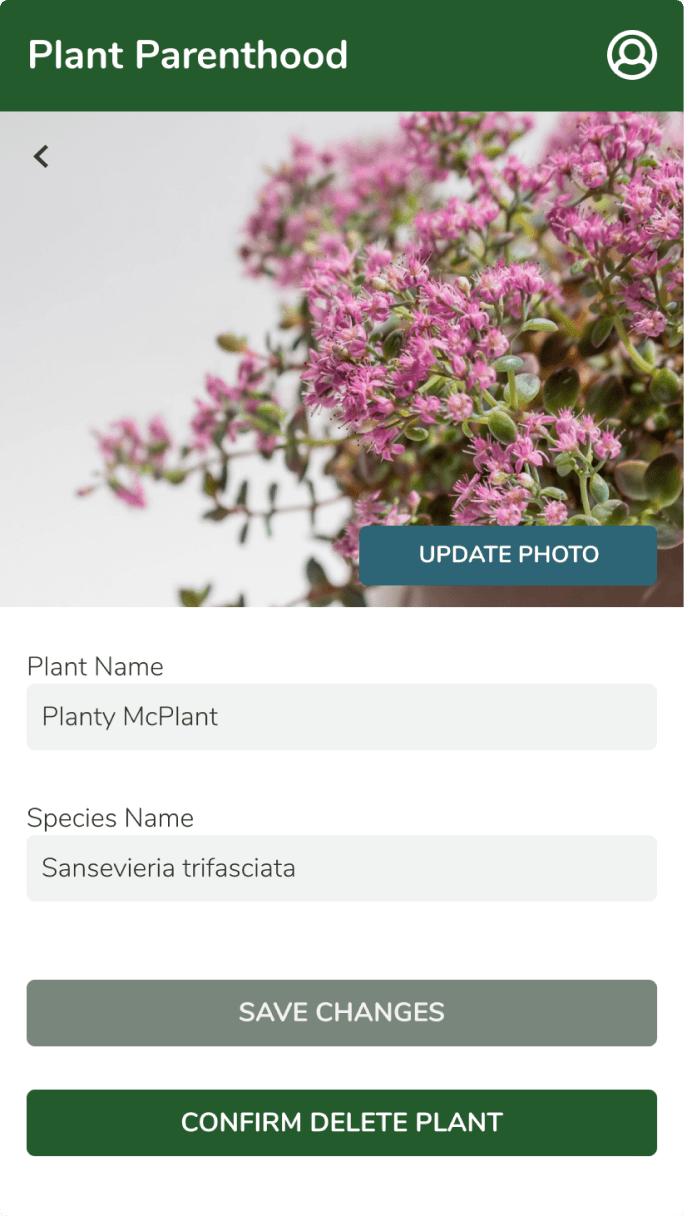
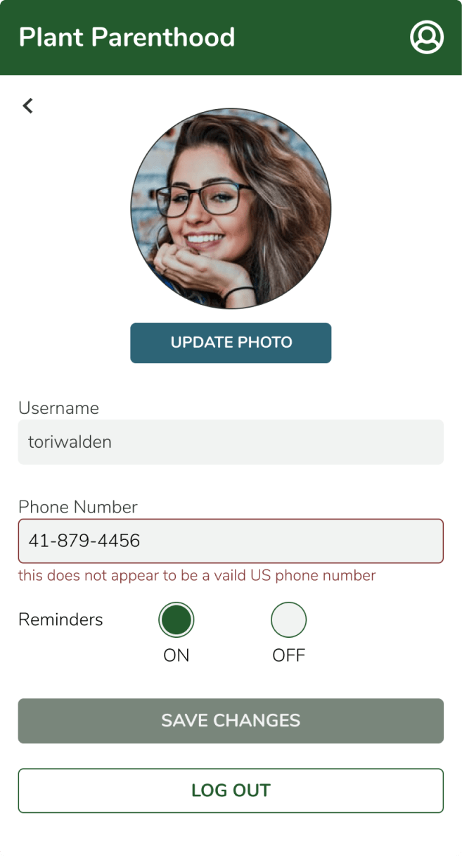
Editing both the plant & user profiles
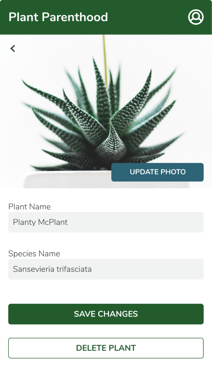
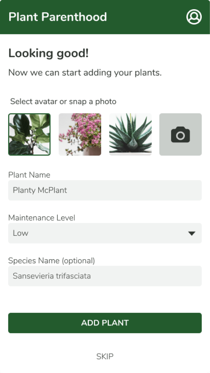
Everything the user tells the app is revisable: the plant’s name, species, photo, or the plant itself. And since onboarding lets you skip, the profile stays fully editable later. A skipped step is a postponed decision, not a locked door.
Simplifying sign-up
My first flows imagined a rich onboarding, so the home page would arrive fully formed. Users experienced it as paperwork. The final version asks for a username, a phone number, and a password, then gets out of the way.
What I learned…
Sole designer, five developers, one week to ship.
Understanding how design pairs with development.
I arrived with everything assembled; the developers arrived with constraints. Translating UX intent into something buildable is its own discipline, and getting everyone genuinely on the same page took time and patience. A design the team can’t build isn’t a design yet.
Leveraging research to make improvements.
Research replaced my idea rather than refining it. The criticism was useful and a little painful, and I kept the thicker skin.
Adapting to restrictions and limitations.
Most of my research-fed feature ideas fell outside the scope. That happens constantly in real product work: new information arrives without notice and redirects everything. Stay flexible enough that the change improves the work instead of shrinking it.