NextBook
Recommendations that shorten the gap between finishing one book and starting the next
Problem space
Finishing a book is easy. Choosing the next one isn’t.
Solution to explore
Curated recommendations built from what a reader loves and has actually read.
Project details
- I had 2 weeks to deliver 2 key features
- I was provided with some design resources from the previous team
- My team included 2 developers and 3 data science partners
Using research to find the highest value features
I inherited the previous team’s research and read all of it. It split our potential users cleanly in two: book lovers always hunting the next one, and people who wish they read more.
Key insights from user interviews
Book readers want to organize their books in personally meaningful ways.
80% of potential users use book-tracking services for one purpose: finding the next book.
People want motivation to reach their book reading goals.
Every user I spoke to wanted to read more, and wanted a goal to push against.
From the previous design to the new
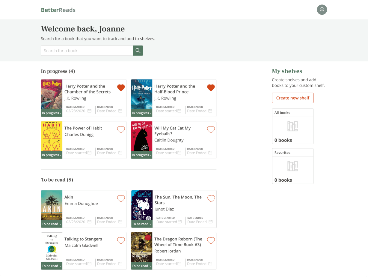
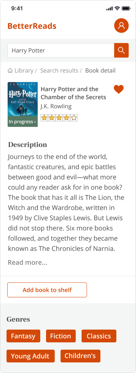
The original primary color read busy and dated. The deeper problem wasn’t ours to fix: every screen of a book app is wallpapered in cover art, dozens of palettes and styles nobody chose. The competition all fought the same noise.
Making color work for us instead of against us
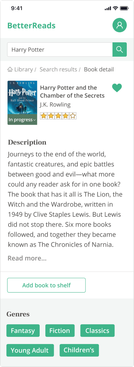
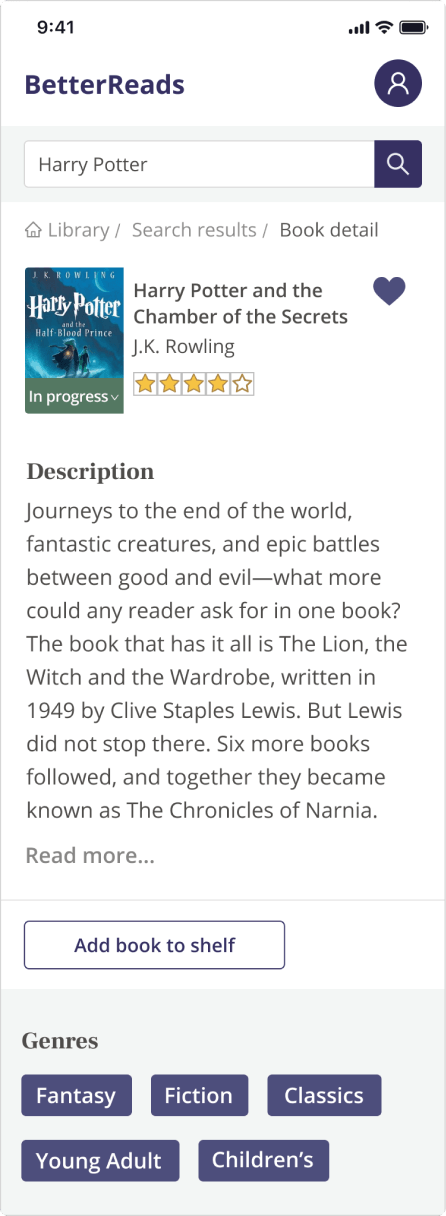
New palettes on the old design just added another voice to the argument. The answer was to remove color from the UI almost entirely and let the covers be the loud ones. They were going to be anyway.
Helping book lovers the best way we can
The data kept pointing one direction: recommendations are the product. Users wanted the next book fast, chosen for them personally.
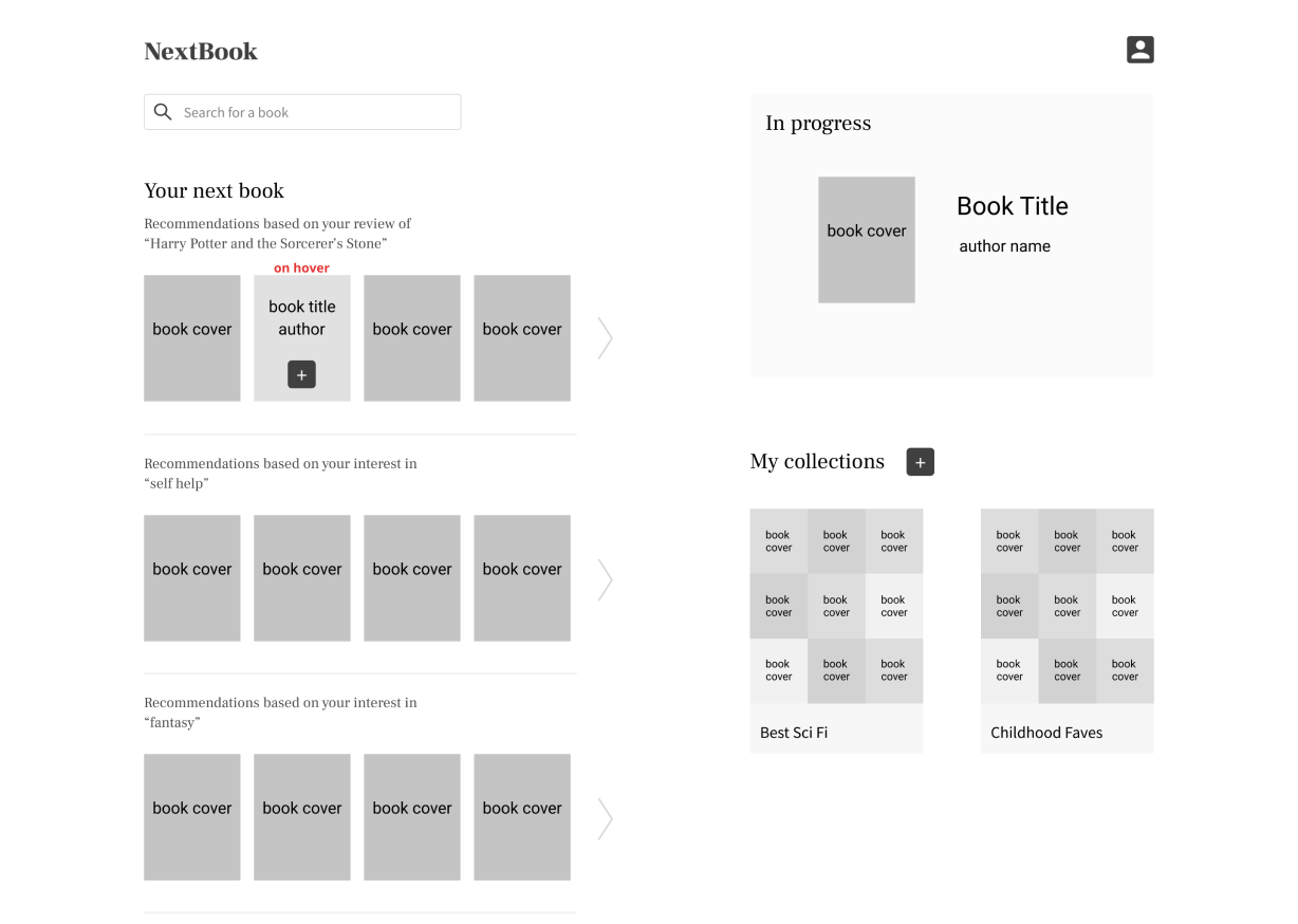
I stayed in low fidelity as long as possible, so testers would react to the interactions instead of the cover art.
Book recommendations right at home
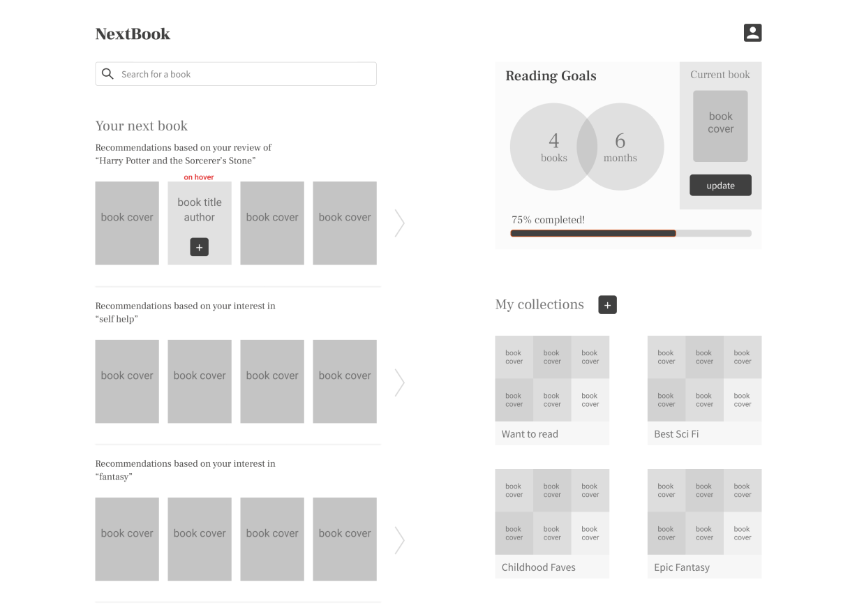
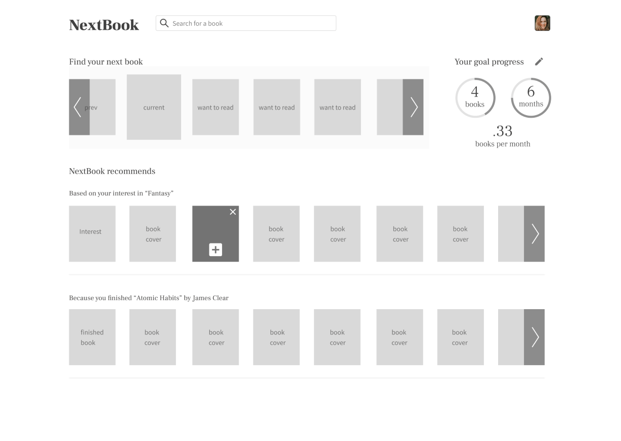
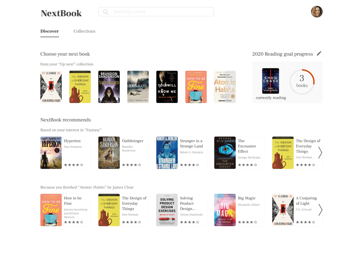
My first iteration showed a snapshot of the whole account. Too busy, no center. I cut everything that didn’t serve the primary task (find the next book) and borrowed the Netflix pattern: horizontal shelves you scroll sideways.
Key insights from home page usability tests
Users loved the idea of book reading goals on the home page.
Every user tested wanted their goal progress displayed on the home page.
Users want to know why we are recommending certain books.
Onboarding collects preferred genres to seed each personal model, so the model always knows why it recommends a book. Users wanted the reason too. A recommendation with no “because” reads as an ad.
Private collections and personal notes
I was sure users would want private notes on their books. They didn’t. They wanted to sort books into private collections with tags. I’d designed for the reader I imagined instead of the ones in front of me, and the interviews corrected me quickly.
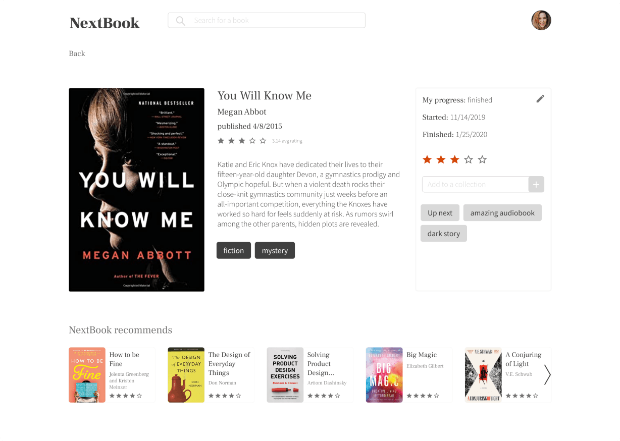
Cutting notes made room to enlarge the cover art, which gives every book details page its own identity for free.
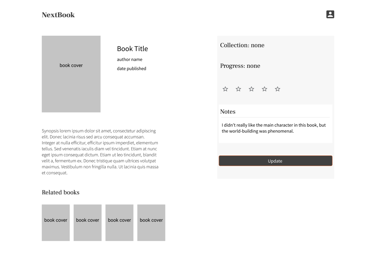
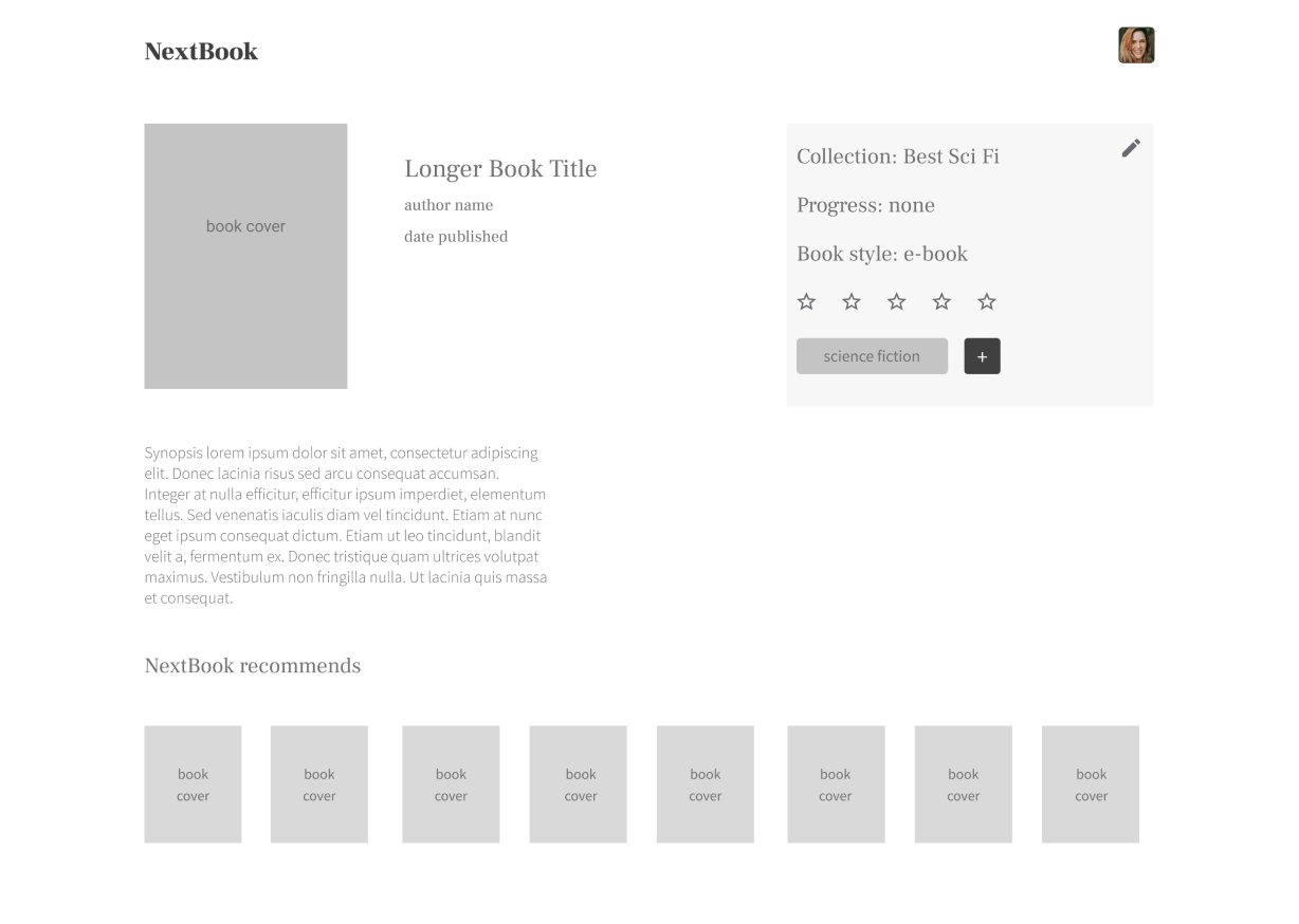
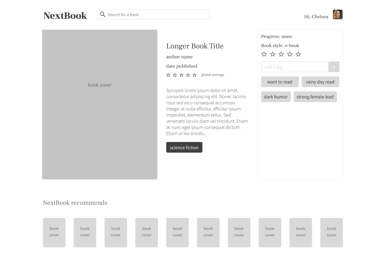
Key insights from book details usability tests
Users want relevant information and literally nothing else.
A few wanted everything. Most wanted a spare view focused on one act: adding the book to their collections.
Related books and recommended books mean the same thing to users.
To me, “related” is taxonomy (same author, series, universe) and a recommendation model weighs far more than that. To users, both mean “books I might like.” The distinction was mine, not theirs, so it stayed out of the interface.
How do readers want their book collections displayed?
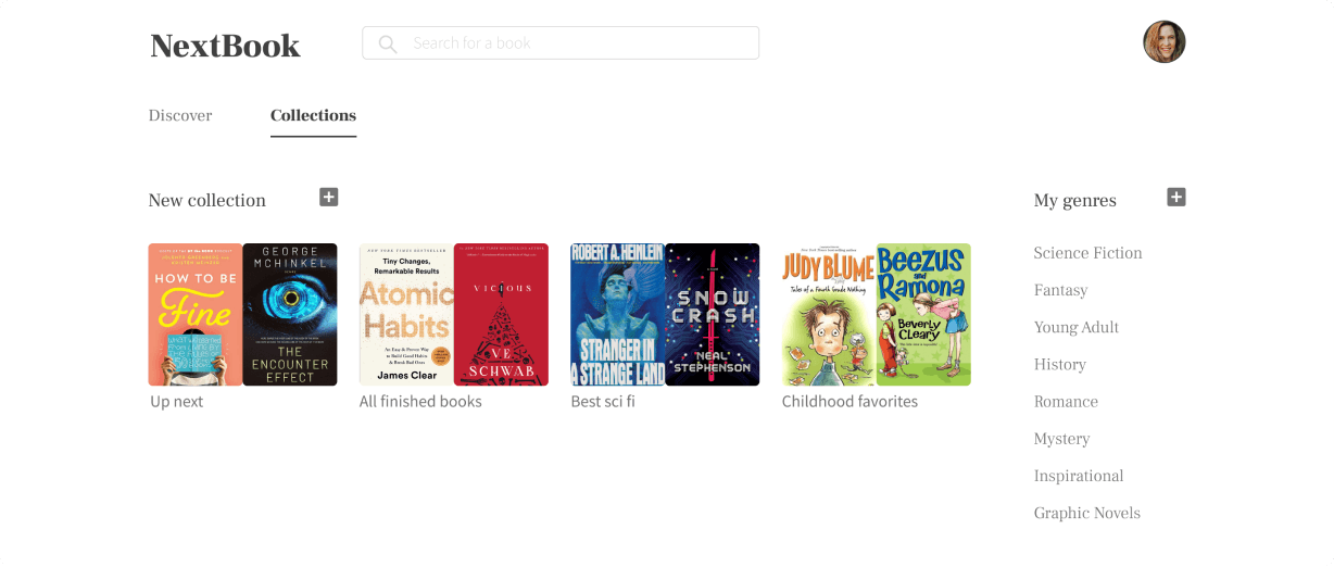
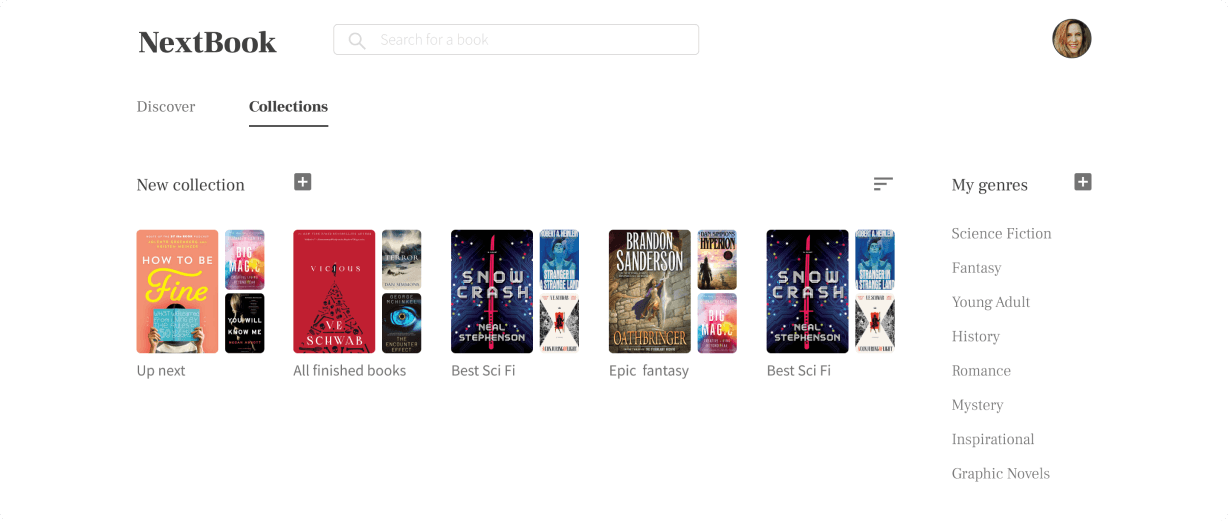
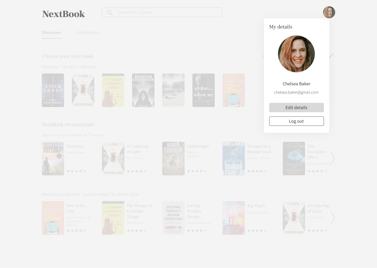
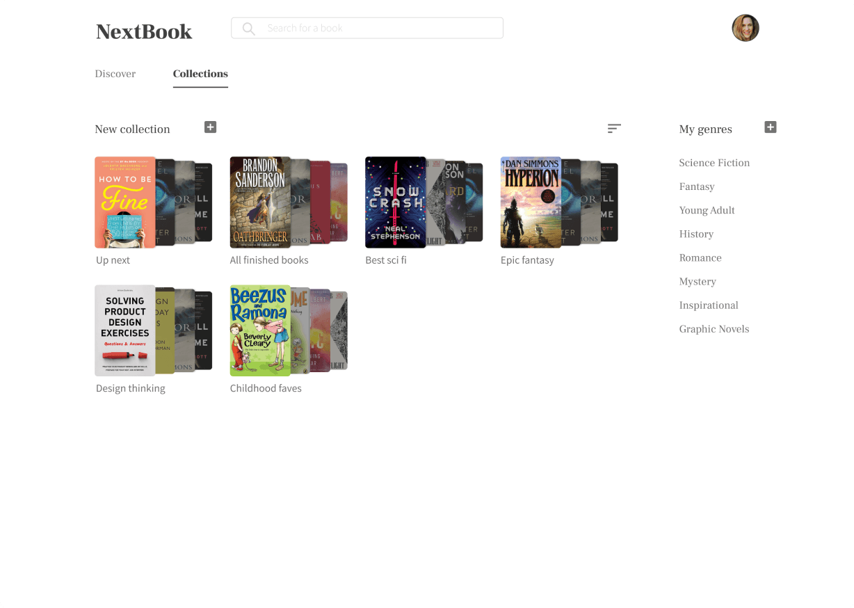
Real covers exposed a navigation problem: the profile page was doing two jobs. I split it into a proper page for collections and a modal for the user profile. Both appear in the final designs below.
Key feedback from preference testing the collections view
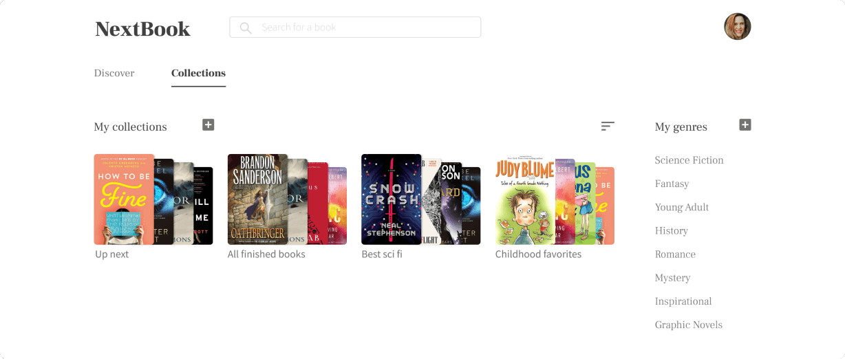
Users thought the stacking of the books created an attention-grabbing feature.
Peers and advisors called the flat cards and the 3D stacks equally acceptable. Users had a preference: the stack looks like books.
Final designs
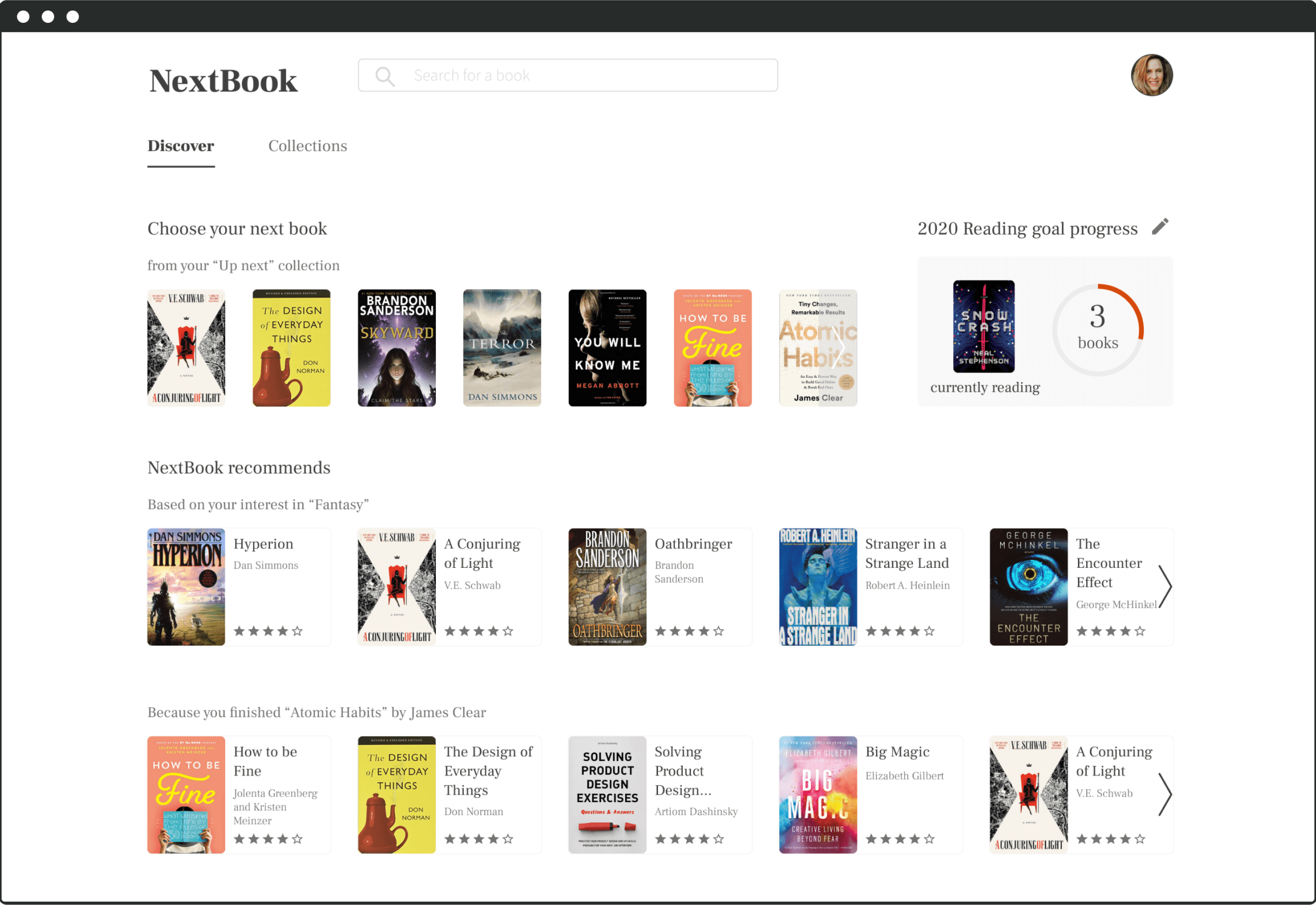
Home is where recommendations are the most important
Recommendations own the entire lower half of the page. Up top, the “Up next” collection makes starting your next book a single decision.
Making space for more valuable features by creating a profile modal
Moving user details into a modal cost nothing and cleared the collections page.
Making collections delightful and practical
The 3D stacks held up in testing: noticeable without hijacking the page.
Book details & enabling users to add books to private collections
Any book, added to any collection. The tag-style controls were the users’ idea, a pattern they already knew, doing what they expected.
What I learned…
My first desktop-only project, and my first lesson in what working alone actually costs.
How to break my tendency to design myself into a box I can’t get out of.
I expected solo work to be faster. It wasn’t. Alone, I went too deep too early, stalled at every fork, and flattened creatively: no one to argue with, no argument to sharpen against. Collaboration is the process, and that includes other designers, not just your developers.
Don’t get spooked by a due date.
Week 3, still wireframing; delivery due at the end of week 4. The doubt arrived on schedule. The lesson: hold your pacing, finish the thinking, then sprint the ending. It landed.